Job Overview
Improve UX across multiple systems for Actors, Agents and Casting professionals
Sole designer for rebrand and merging of platforms
⚡
Small, high velocity team
Multilingual and Accessible platform
Built design system & component library
Case Study
·
4 min read
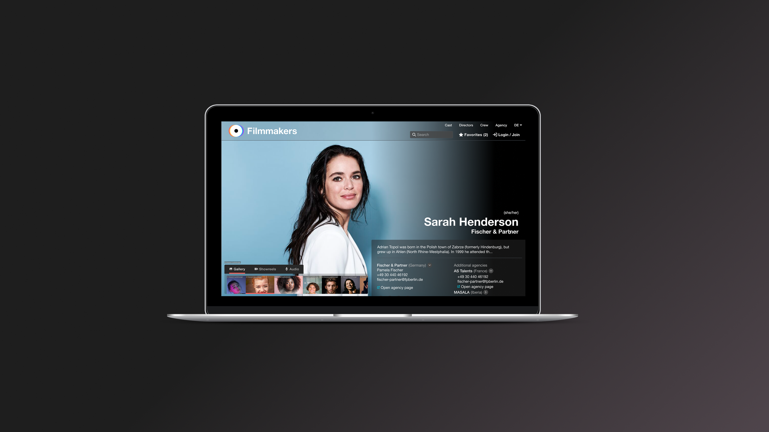
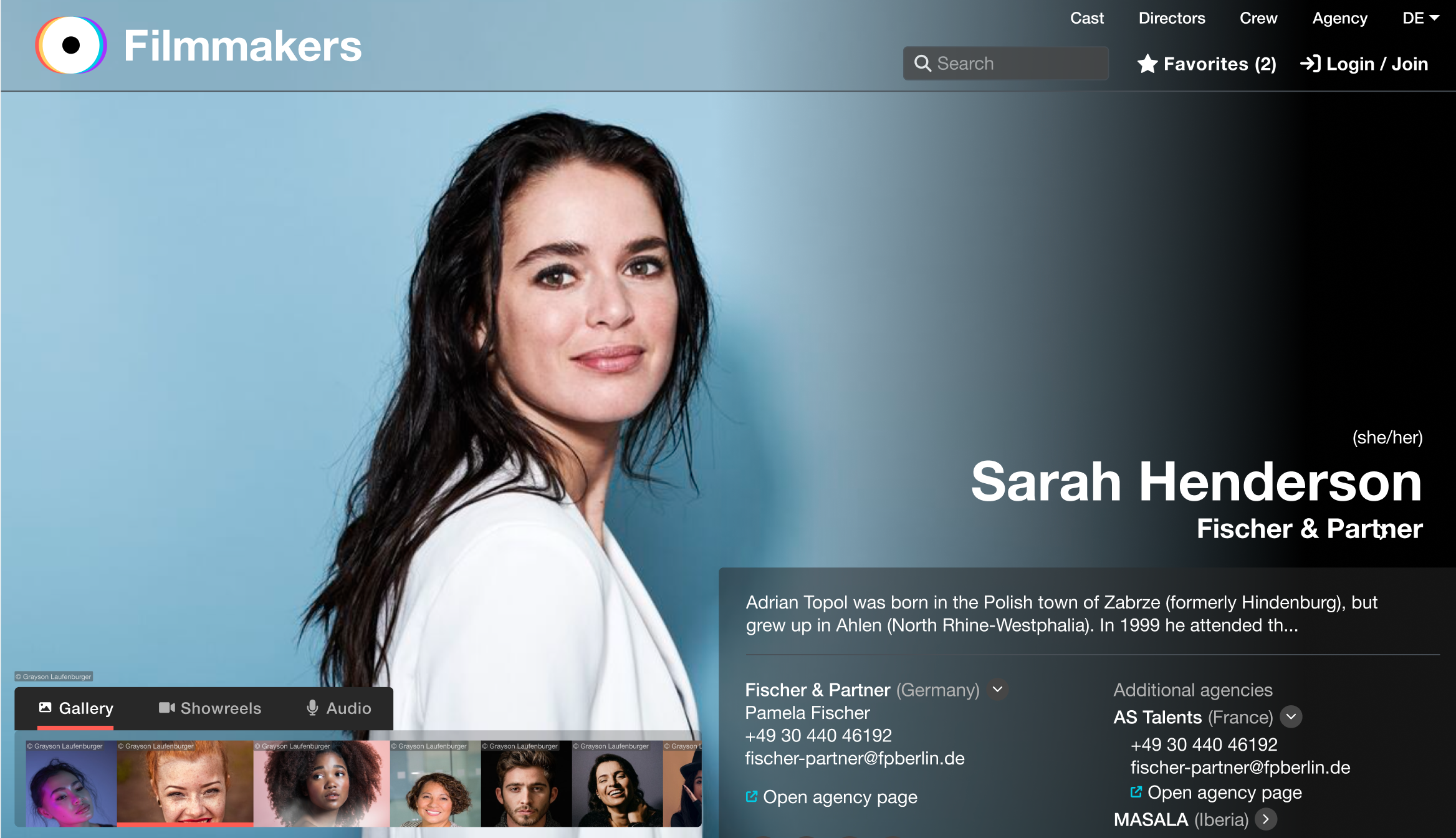
Stunning, informative
actor profiles
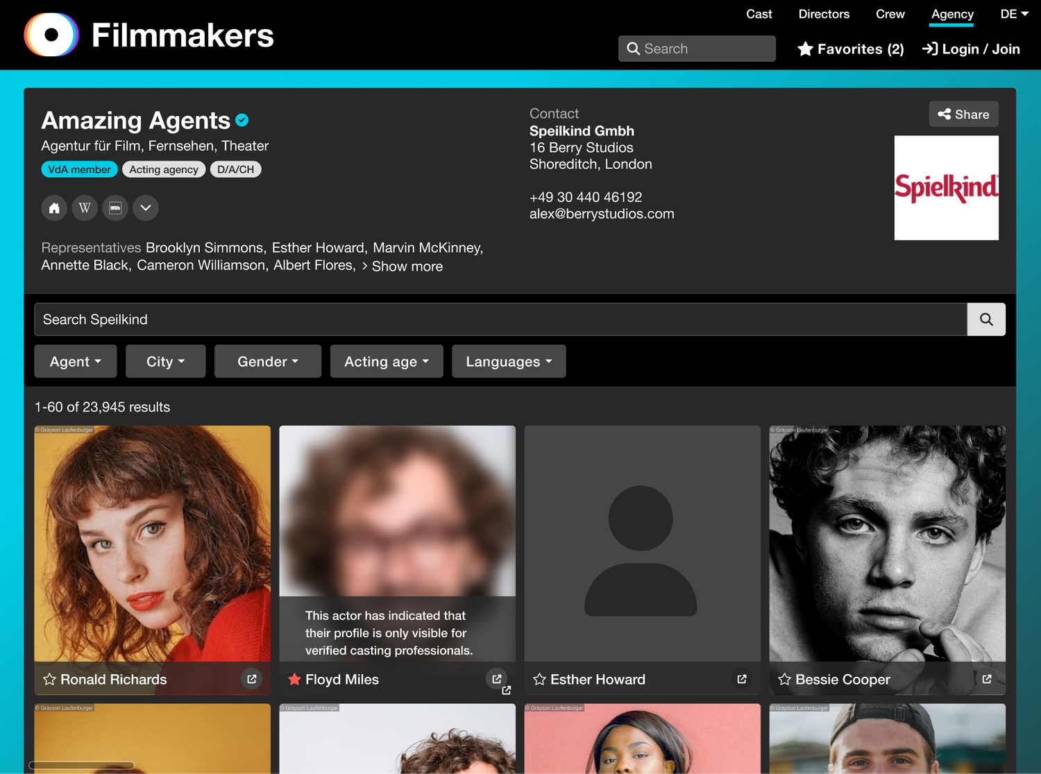
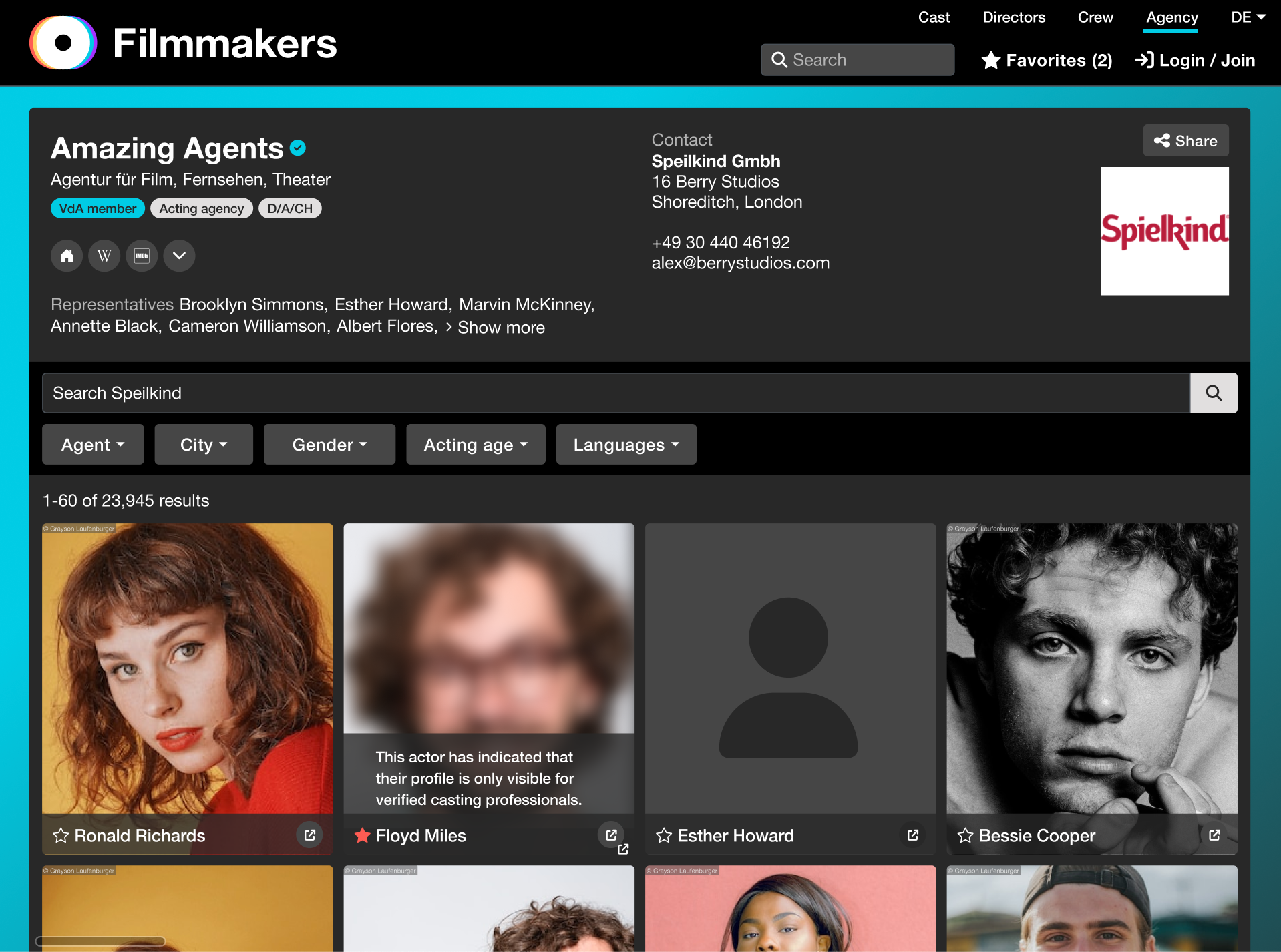
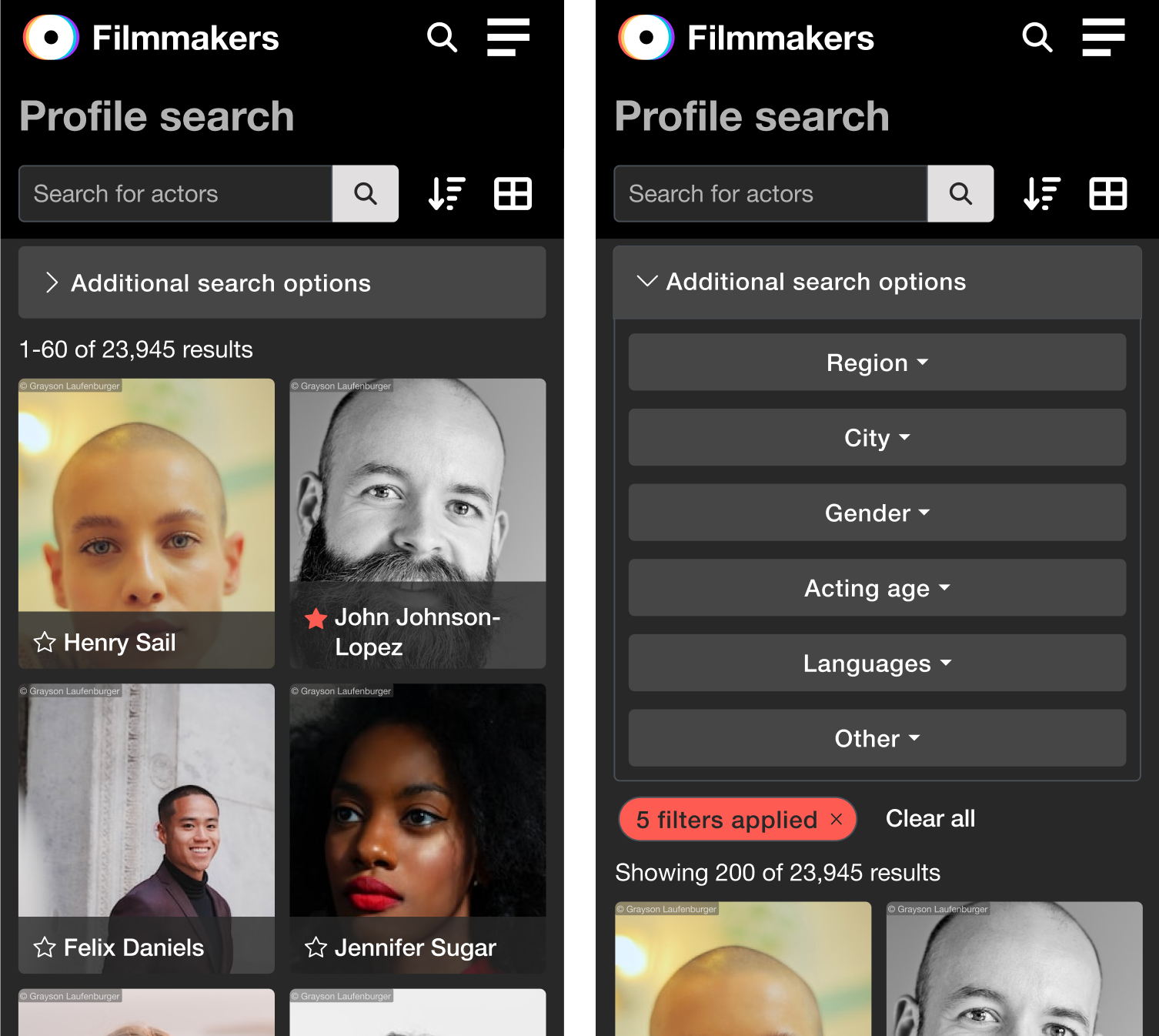
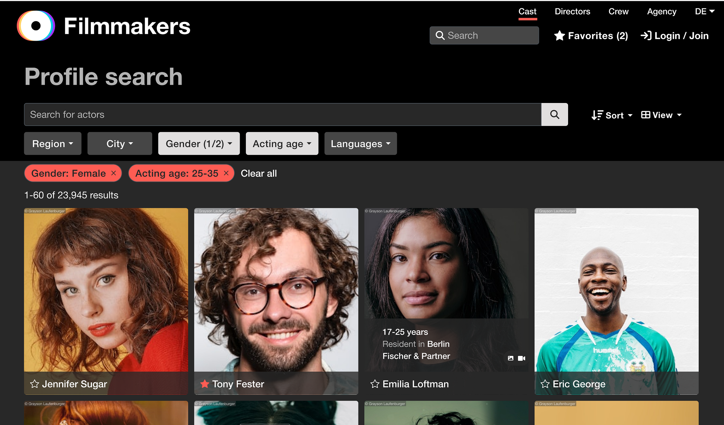
The Challenge
- Design modern, visually engaging actor profiles that present diverse media and content
- Balance aesthetics with accessibility
- Give actors and casting professionals an experience that's both delightful and efficient
Approach
I undertook a range of research methods that helped me gather requirements and avoid making assumptions:
"Profiles must be beautiful and a delight to scroll through."
"Images and media need to shine."
"The design must work for both high- and low-content users."
"Incorporate the new brand look and feel."
Competitive research
I began with competitive research, analysing not only actor profile platforms but also leading media-driven websites for inspiration around hierarchy, layout, and image handling.
Data research
Using data research, I identified which types of content (headshots, showreels, credits, and biographies) were viewed most frequently. These insights guided how visual weight and interaction states were prioritised in the design.
Visual hierarchy and wireframing
This data shaped the information hierarchy, ensuring that essential visuals were front and centre, while contextual details remained accessible through smooth, layered navigation.
Creative exploration
Working iteratively in Figma, I explored several layout systems. Key explorations included:
⊞
Flexible grid layouts
To handle profiles with varying content density on mobile and desktop
◈
Smart image recognition and layout
Intelligent cropping and display of headshots and portrait images to ensure every actor looks their best across all screen sizes
▶
Media-first layouts
That allowed seamless transitions between images and showreels
Accessibility & inclusivity
Remained core design principles — ensuring all content could be enjoyed across devices, without sacrificing beauty
Multilingual content
All layouts designed to support multiple languages without breaking hierarchy or visual balance
◐
Dark & Light mode
Every component designed and tested across both colour modes from the start
Outcome
"
A visually rich, accessible, and intuitive profile experience that elevated the brand identity while improving usability for fast-paced casting workflows.
1
A media-first interface with full-width immersive visuals
2
Smooth scroll transitions from image galleries into detailed bio content
3
Dynamic navigation through sleek headers and menu bars to allow easy access to content and assets
4
Typography and iconography aligned with the new brand's playful yet professional tone