Case study — Intuitive Membership Payments
Product designer
Spotlight — spotlight.com
Challenge
Redesign the membership payment experience, which users found confusing and inconsistent,
Reuse as much of the existing infrastructure as possible.
Create a streamlined, intuitive flow that simplified decision-making and aligned with the organisation’s new visual identity
Result
A unified, intuitive experience that both celebrates the brand and supports frictionless membership management.
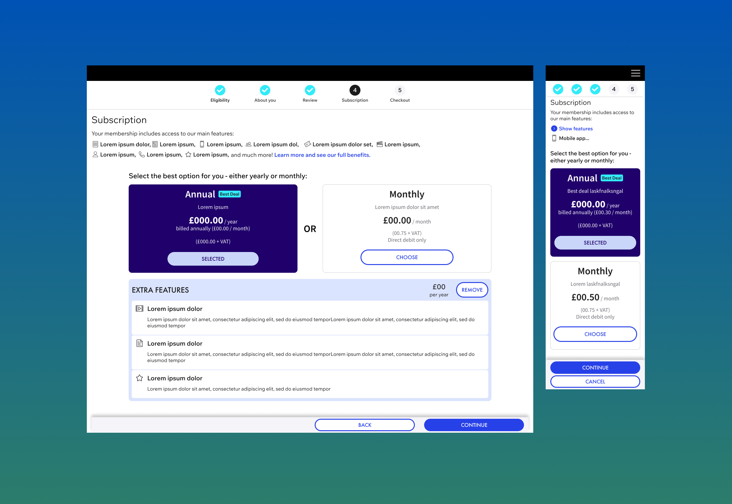
Research & Discovery
I started by mapping existing user flows to identify friction points in the payment journey.
User feedback highlighted confusion when comparing or switching between membership tiers and lack of clarity around membership offerings.
To validate these insights, I analysed competitor membership models to understand best practices in transparency and conversion design.
Design Approach
Working collaboratively with developers, I explored solutions that balanced user needs with technical feasibility.
Key design priorities included:
Simplifying navigation between membership tiers
Clarifying the membership offerings
Ensuring the flow supported multiple user scenarios (new sign-up, renewal, upgrade, downgrade)
I produced interactive Figma prototypes to test early with users, validating copy clarity, button hierarchy, and step logic before final handoff.
Outcome
The final design delivered:
A clean, guided flow that clearly connected membership selection, pricing, and payment
Dynamic UI showcasing new branding and increasing engagement at the checkout
Streamlined checkout that reduced developer workload by consolidating multiple user paths into one flexible system
Early testing showed improved task completion rates and reduced user drop-off during payment