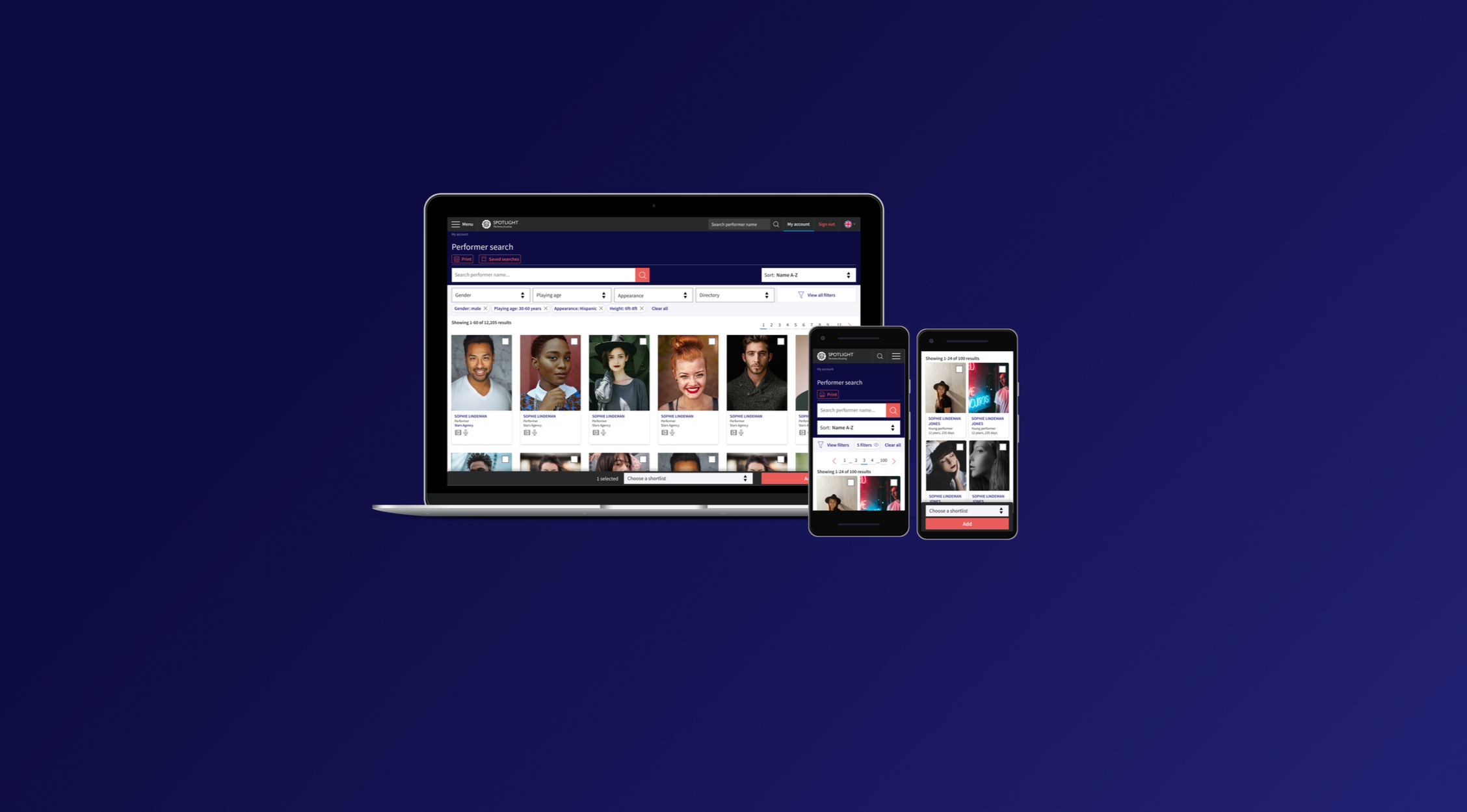
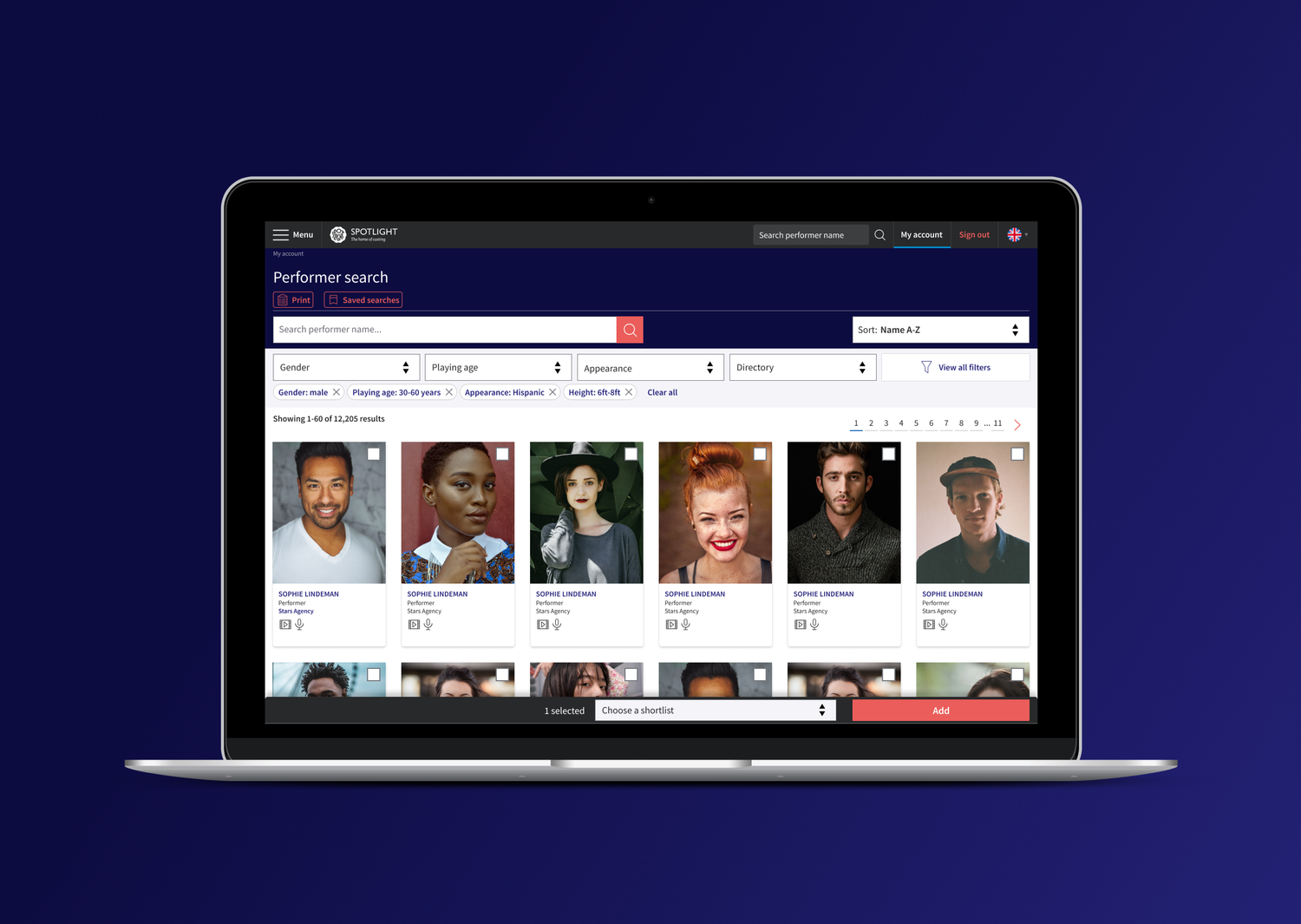
Enhancing Talent Search for Busy Casting Directors
Redesign a dated, non-responsive search tool used by casting professionals to find performers across a database of over 70,000 entries.
- Simplify complex search behaviours built up over years of organic growth
- Improve speed, accuracy, and accessibility for casting professionals under time pressure
- Create a clean and beautiful experience across desktop and mobile platforms
Research
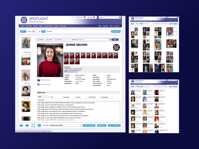
Phase 1 involved in-depth user interviews and card sorting workshops to understand how we could organise the complex, outdated search options within the legacy platform. This internal workshop helped organise and streamline information.
Phase 2 I then considered these outcomes alongside review of data analytics and user interviews.
Search and filter need to be used both together or independently.
Casting professionals often search for a specific name and want to access that person quickly without returning all results.
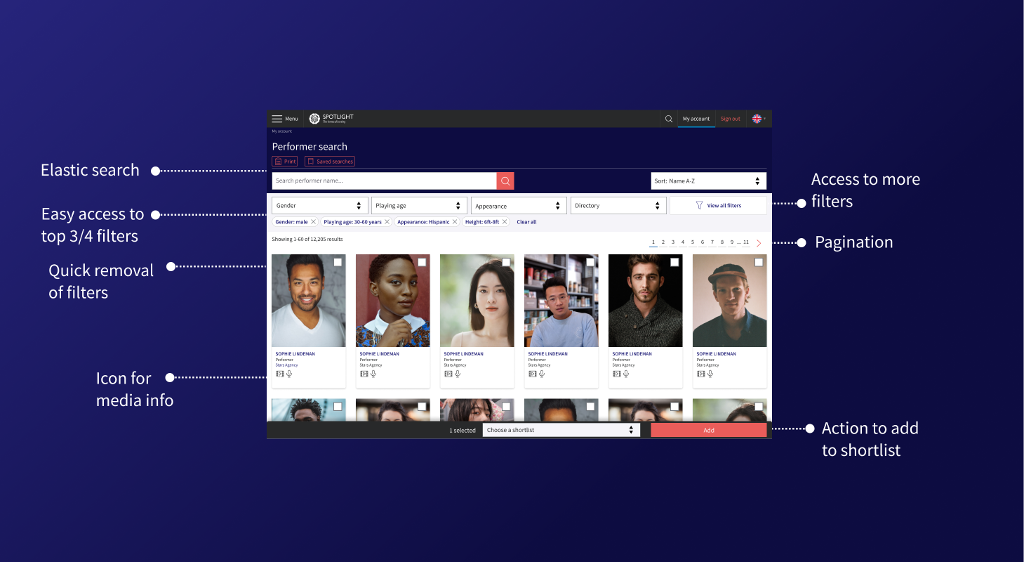
The top five filters appeared in 80% of all sessions.
Users often needed repeated access to niche filters beyond the top set.
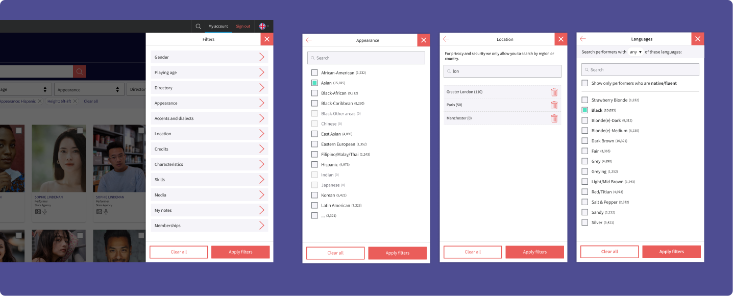
Certain filters needed bespoke UI components that met complex user needs.
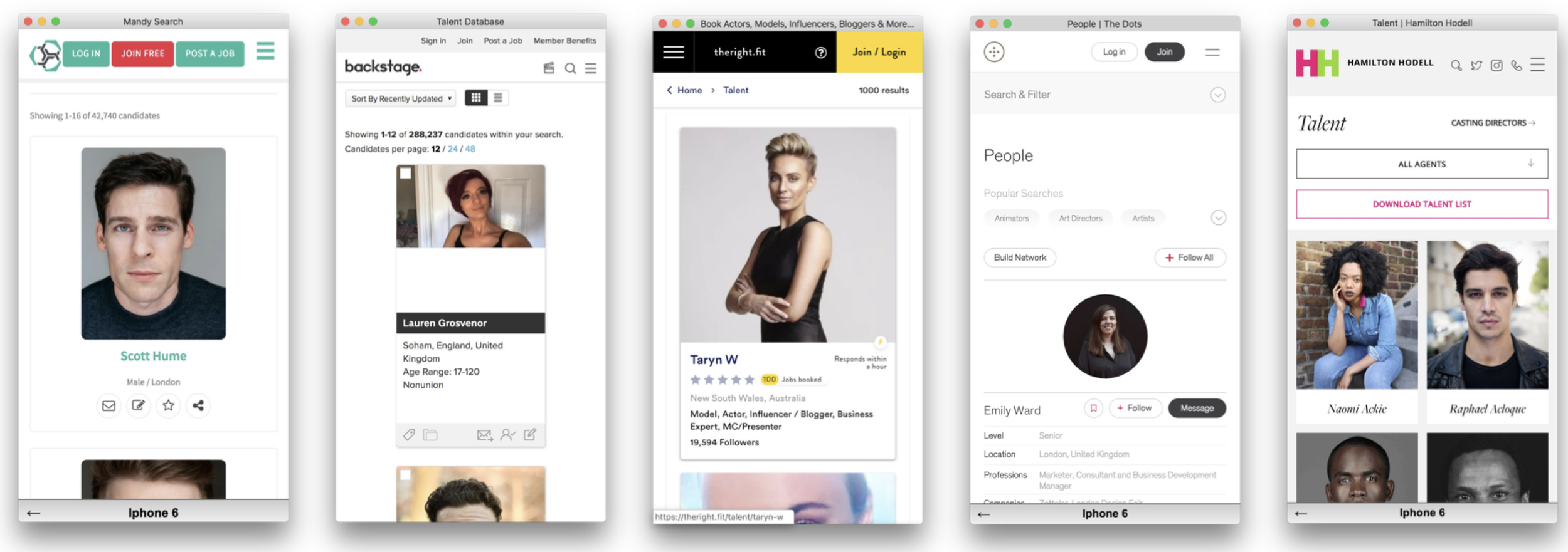
Leading e-commerce and booking platforms, analysed for filter structure, progressive disclosure and component flexibility.
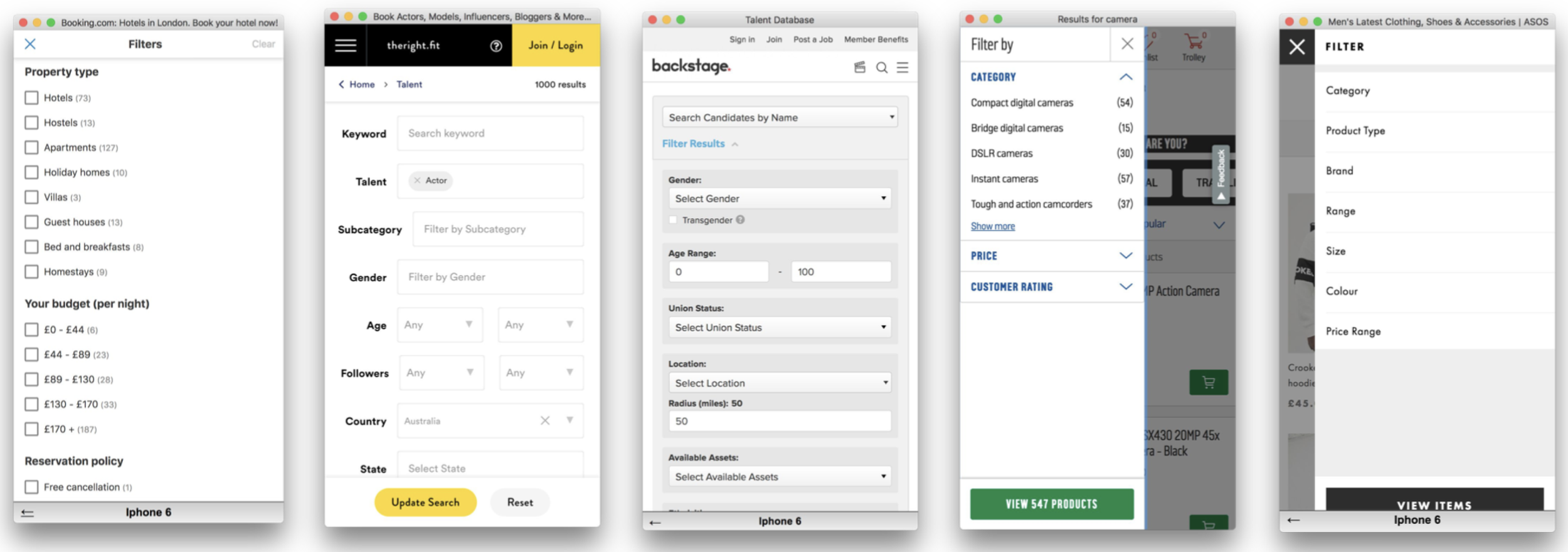
Direct competitors reviewed for talent search UX, filtering patterns, and profile card conventions.
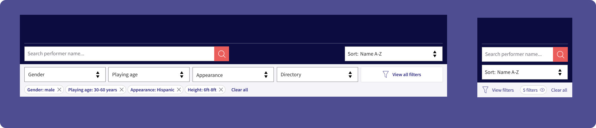
A filter drawer is the best option for a mobile-first filter solution, with the flexibility to accommodate diverse and complex filter components.
Search and filter logic must include lazy loading, real-time results updates, and intelligent handling of zero-results states.
How can we incorporate actions alongside dominant search and filter components without cluttering the primary experience?
From the research we defined three principal user journeys that the search and filter page would need to cater for. These shaped every design decision — from the initial lo-fi sketches through to the finished UI components.
 Journey A
 Journey B
 Journey C
Using a lo-fi prototype we sketched out a number of flows with basic filter designs to ensure the end-to-end journey worked for all three scenarios before committing to visual design.
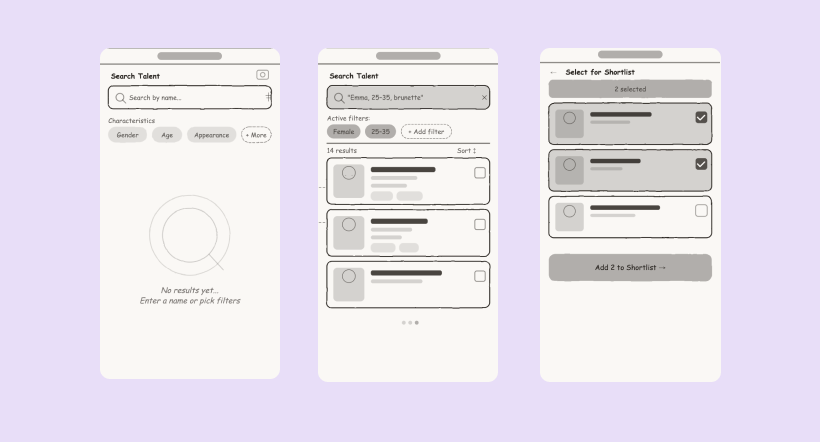
With an initial flow tested internally, we built out the core UI components using the new brand. These were considered as a system, designed to work cohesively across different areas of the site. Some were brand new; others were adapted as we introduced new scenarios and edge cases.
We took the prototype to test with leading casting professionals to validate our design decisions, asking them to complete the A B C user journeys in sequence.
New UI elements were easily navigable. Participants moved through the interface confidently with minimal guidance.
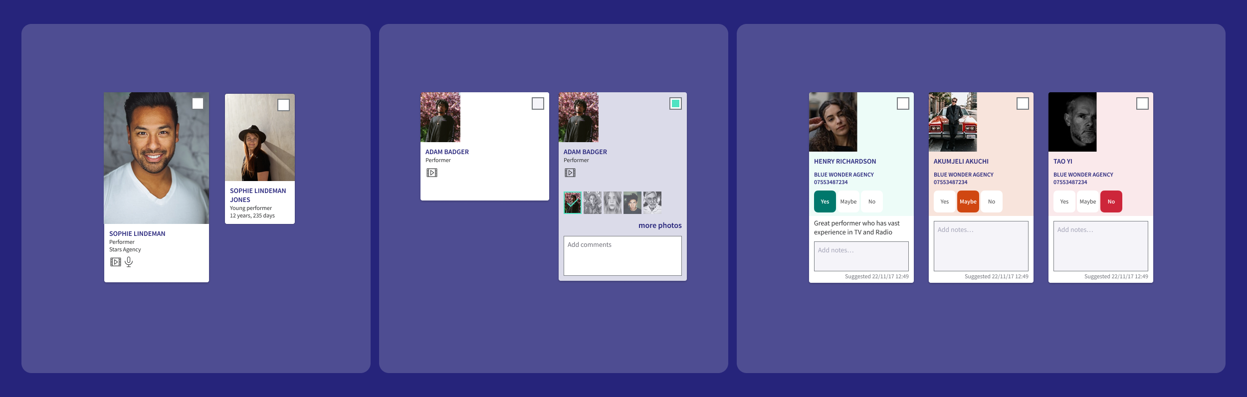
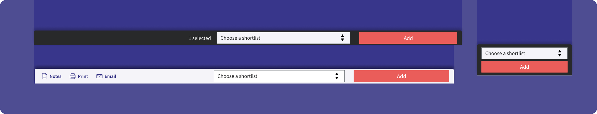
The actions panel for adding an actor to a shortlist was new but learnt easily. Better visibility was needed to confirm actions had been completed.
The designs were refined following these insights and we completed multiple rounds of testing, tweaking components each time. The aim was to surface as many areas needing refinement as possible ahead of dev work, as this new filter system was to be launched as part of a new branded platform.
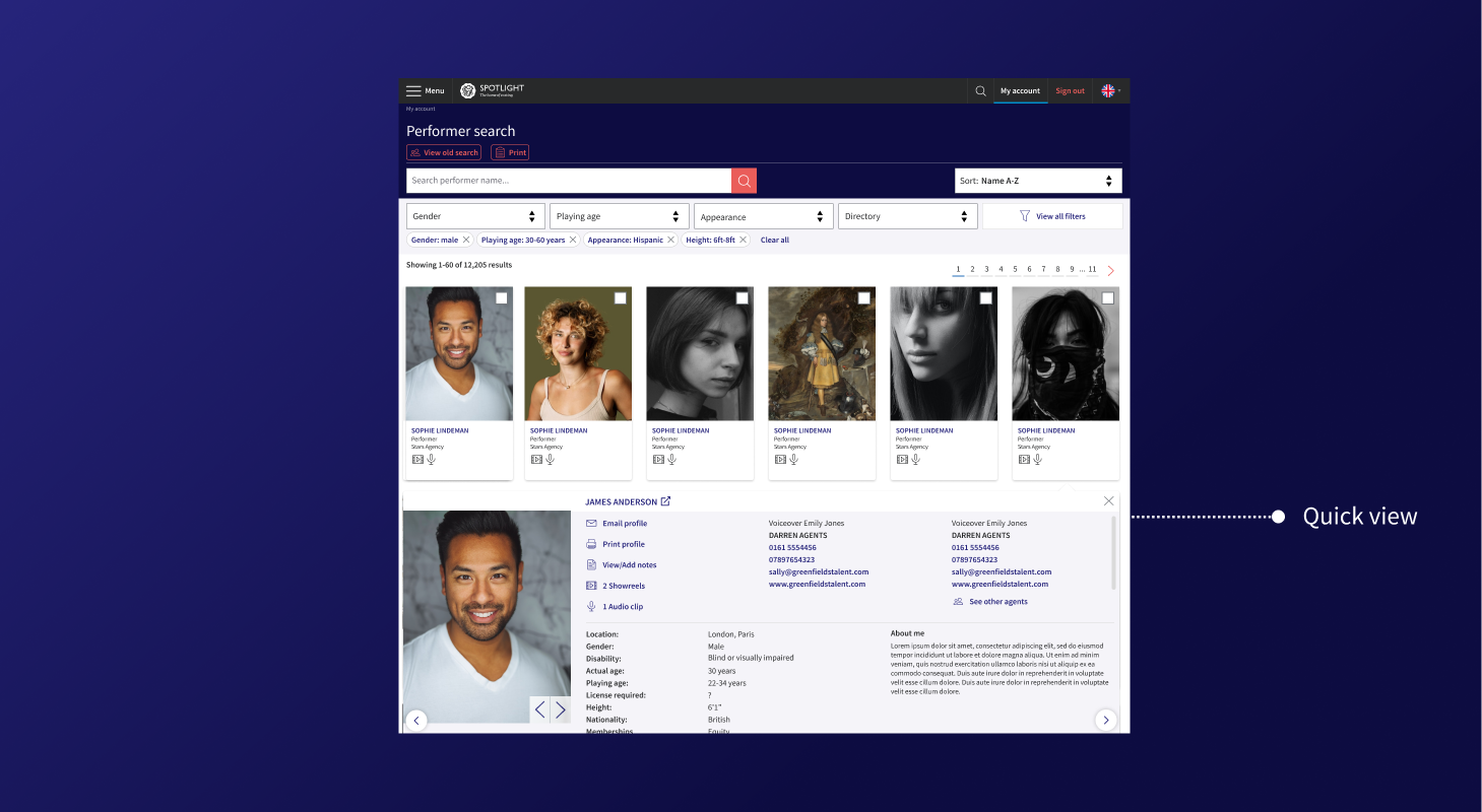
A dropdown on the search bar that previews an actor's headshot, name and location. Casting professionals can navigate directly to a profile without returning to the full results page.
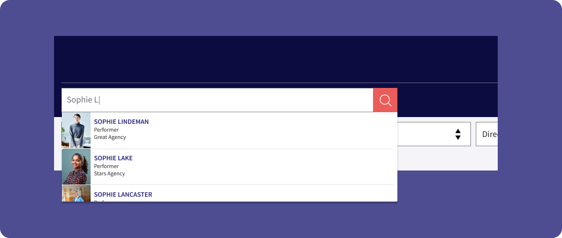
Faster access to performer details without leaving the results page.
The final piece of the design work was a close collaboration with the engineering team to ensure the filter and search system behaved exactly as users needed.
Elasticsearch
Fuzzy matching and relevance ranking ensured performers surfaced even with partial or alternative name spellings.
Real-time Updates
Results updated instantly as filters changed. No page reloads, no dead ends.
Filter Specs
Full documentation of filter hierarchy, interaction states and edge cases delivered to the engineering team.
We tested core search and filter functionality before any wide release. This surfaced UX issues in filtering logic and general views in a low-stakes environment.
We intentionally launched with a subset of filters and asked agents directly: "What filters do you need?" This let users drive prioritisation for the next sprint rather than us making assumptions.
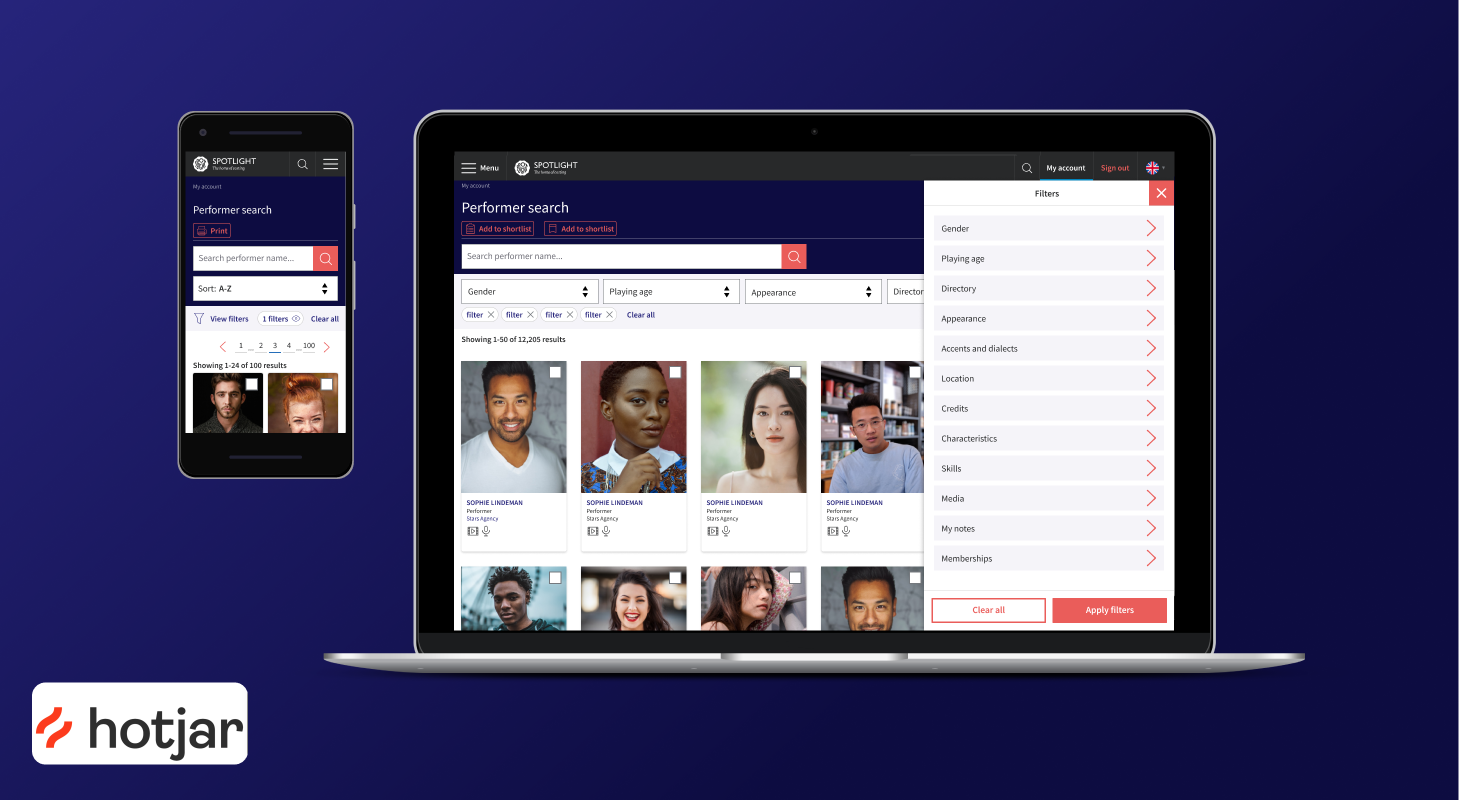
We released a reduced quick-view card with Hotjar session recording, asking users what they wanted to see. This ensured card content was driven by real need, not assumption.
Hotjar feedback and session recordings continued post-launch, giving us a live signal on user behaviour and satisfaction as the wider audience encountered the new system for the first time.
Much of the negative feedback referenced functionality already on the product roadmap or reflected personal aesthetic preferences, not core usability failures.
The staged rollout gave us confidence in the direction. Real user input, not assumptions, shaped both the filter set and the quick-view card content before full release.
What's important to you?
I'll tailor a summary of this case study around what matters most to you.