A simpler way to upgrade memberships
Spotlight is a performer membership platform where actors sign up, renew and upgrade. A new membership tier had been added, and almost nobody could find it. Business decisions on the tiers were still being made while I designed, which added complexity.
This project went from inherited design, to an improved flow, and finally a quick rework.
Problem
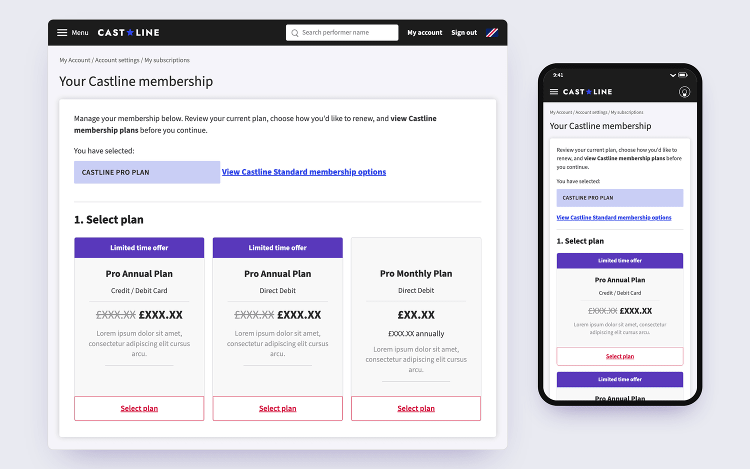
The payment flow had been shaped around the data team's requirements as the new tier was introduced, not around what performers needed to understand when choosing. I audited the inherited purchase screen end to end and found four problems:
- Switching plan was a small text link, hidden in body copy.
- Two plan cards had the same name and differed only by payment method.
- Nothing on the page said what each tier offered.
- Pricing was shown differently across cards and pages, so the real cost was hard to compare.
The constraints: reuse the existing payment infrastructure, a tight timeline, and later on tier decisions that were still being made while I designed.
Decisions
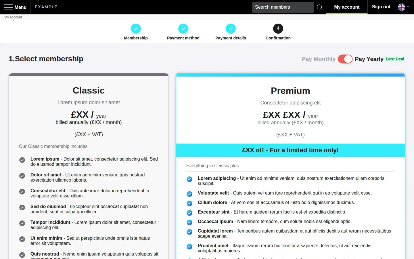
Two steps. I split the flow into two pages: choose the membership plan first, then the payment type. The old screen mixed them and overwhelmed users.
Onboarding. In longer new member onboarding flows a step tracker was added to show people where they are and what's left. Reducing drop off rates.
Reducing rework. Following discussions with the developers, I found a way to reuse the payment infrastructure but keep it on the second stage of the payment flow, and only showed the payment method options and forms once they had decided membership type.
Internal testing. In the redesign, everyone found the tier switch in under 5 seconds.
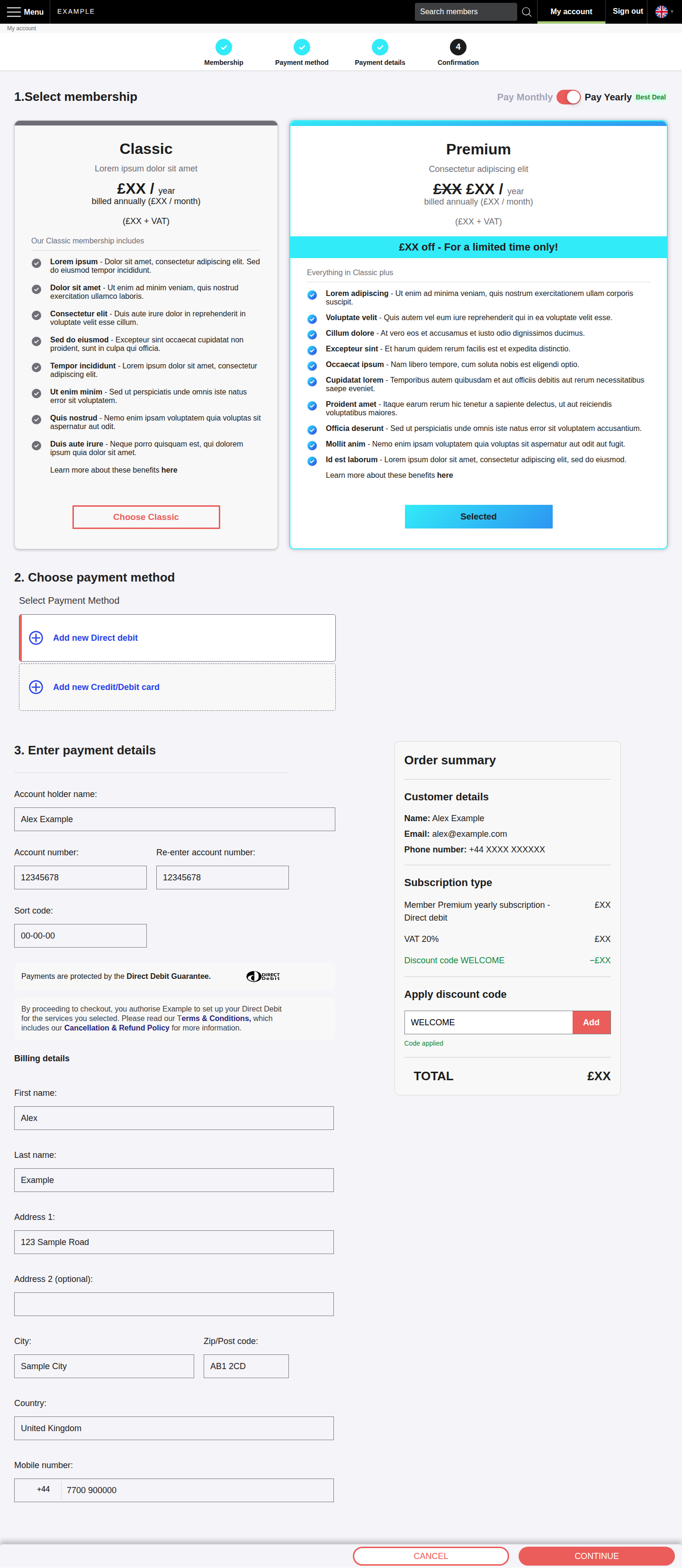
- 1
Step tracker
Ticks off each step as it’s completed.
- 2
Monthly / yearly switch
True cost can be compared before choosing. The bar stays pinned while scrolling the plans.
- 3
Plans side by side
Classic and Premium sit next to each other as equals.
- 4
Consistent pricing
Every plan shows price, billing period, monthly equivalent and ex-VAT figure - in one place
- 5
What each plan includes
Benefit lists with “Everything in Classic plus” making the step up between tiers clear.
- 6
Clear selected state
- 7
Payment method after the plan
Payment method unlocks only once a plan is chosen.
- 8
Progressive payment details
The details form stays greyed out until a method is picked, then validates as you go.
- 9
Order summary always in view
Summary stays pinned beside the form as you scroll.
- 10
Sticky action bar
Cancel and Continue are always within reach. Continue stays disabled until everything needed is filled in.
Second rework
After launch, performers reacted badly to the new tier, not because of the design but because it touched on a sensitive area of the industry. The business needed options quickly.
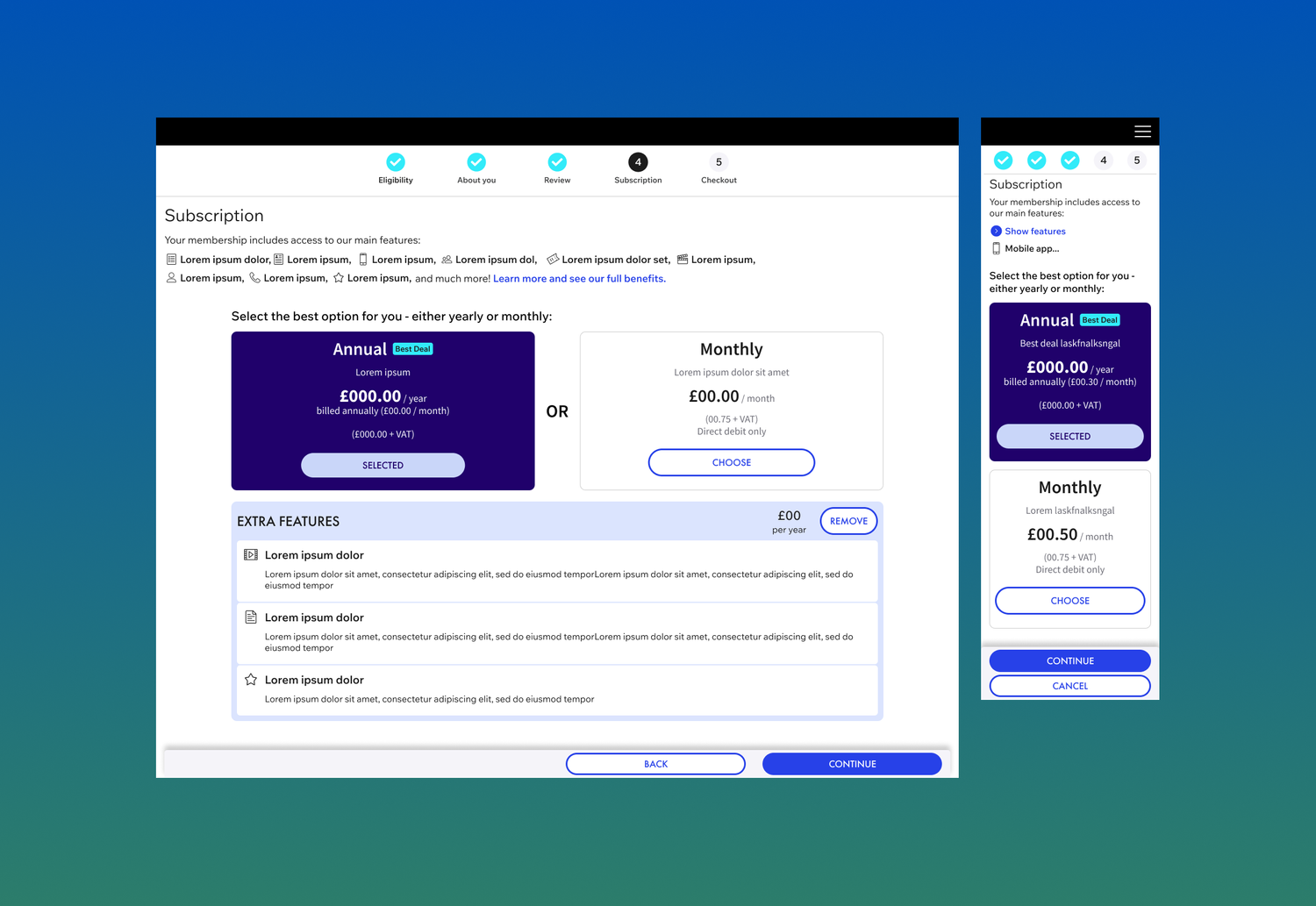
From a loose brief, I designed and prototyped several directions. The brief focused on keeping as much of the new framework as possible but allowing a more flexible membership selection of add-ons.
- 1
Existing framework
Each direction was designed and prototyped using the existing framework.
- 2
Every user type
New sign-up, renewal, upgrade and downgrade, each with its own mapped journey.
- 3
Ready to hand over
Specs, prototypes and flows, so a new designer or the PM could take it straight to developers.
Result
Under 5 seconds
Internal testing on the first rework, went from 4 of 5 people failing to find how to upgrade their membership within 5–10 seconds to everyone succeeding in under 5.
Undecided
The final direction for the second rework hadn't been decided when I left the project. However, I think my proactive reaction to the customer response on this project shows my ability to work with limited direction, and produce designs that are ready to flex with the messiness of the real world.
Reflection
Designing for ambiguity became the skill I'm proudest of on this project. I learned that building systems which hold up under changing business conditions is as much a part of product design as building for changing user needs.
Contact
Or message me on LinkedIn