Enhancing talent search for busy casting directors
Redesigning a dated, non-responsive search tool into a fast, accessible and beautiful experience — across a database of more than 70,000 performers.
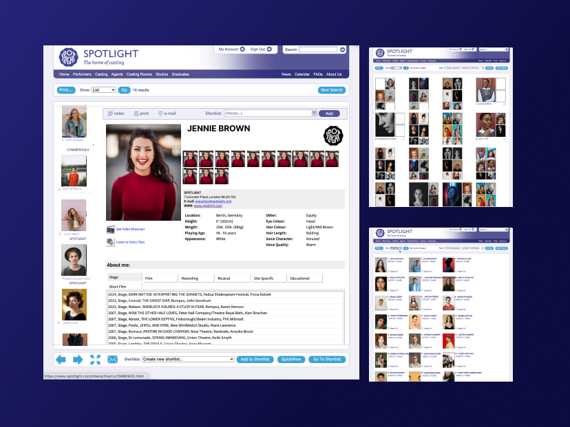
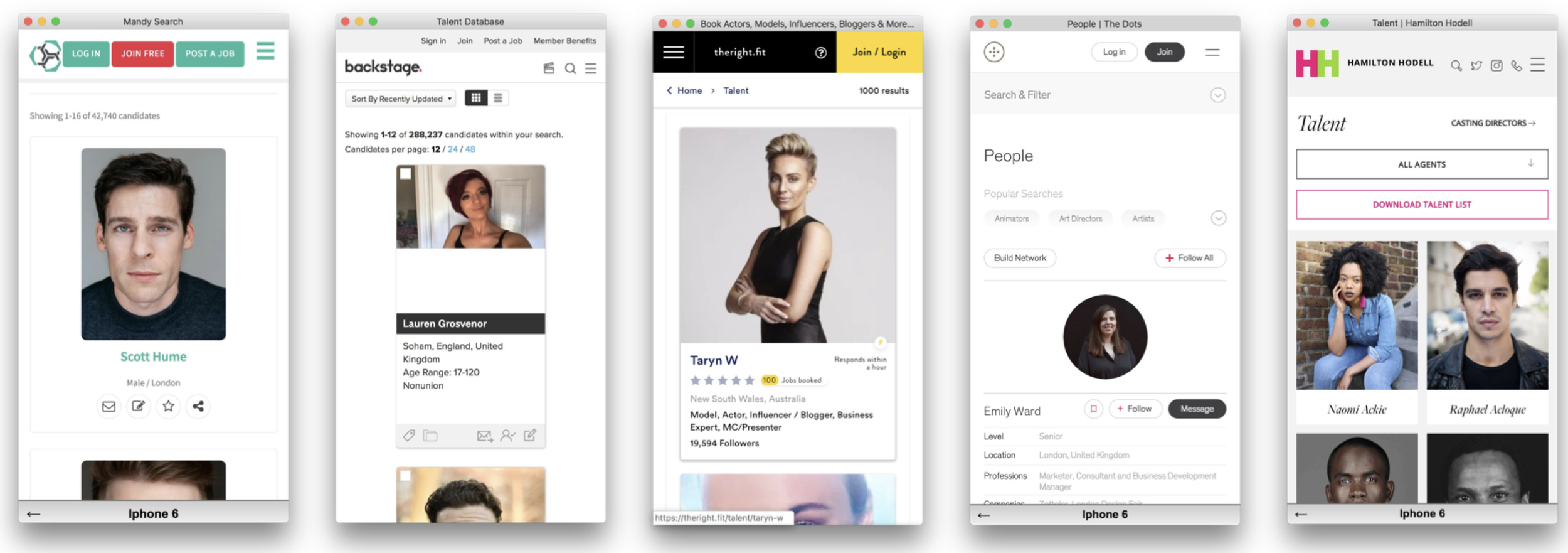
A powerful search tool that had outgrown itself
Spotlight's search is used by casting professionals to find performers across a database of over 70,000 entries — but the tool had grown organically for years into something dated and non-responsive. The brief was to rebuild it as part of a wider rebrand.
- Simplify complex search behaviours built up over years of organic growth.
- Improve speed, accuracy and accessibility for professionals working under time pressure.
- Create a clean, beautiful experience across desktop and mobile.
Two phases of listening before designing
Phase 1 involved in-depth user interviews and card-sorting workshops to understand how we could organise the complex, outdated search options within the legacy platform.
Phase 2 weighed those outcomes against a review of data analytics, customer surveys and a further round of user interviews.
Key findings
Learning from the best search experiences
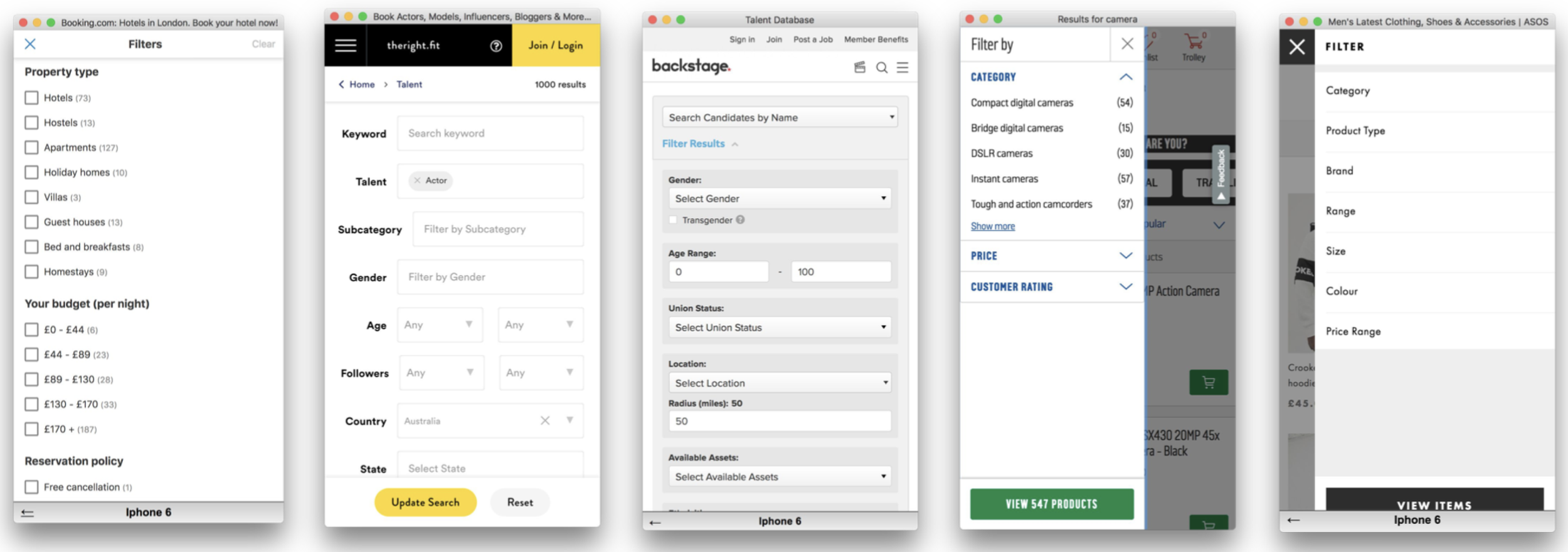
With this picture in place, I researched both our competitors' search tools and search best practice on leading platforms such as Amazon and LinkedIn — with a focus on mobile-first solutions.
We deliberately rejected the fixed filter panels common across competitor products — they assumed desktop and didn't flex for the mobile use cases our research had surfaced.
Key insights & questions
- Filter — a filter drawer is the best option for mobile-first filtering, flexible enough to hold diverse and complex components.
- Logic — search and filter must include lazy loading, real-time results updates and intelligent handling of zero-result states.
- Actions — how do we add actions alongside the dominant search and filter components without cluttering the UI?
Three journeys the page had to serve
From the research we defined three principal user journeys the search and filter page would need to cater for.
"I want to find a specific performer whose name I already know."
"I'm looking for an actor matching specific physical and professional criteria."
"I'm looking for an actor by location, language, or accent."
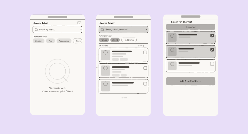
Lo-fi prototype & flow testing
Using a lo-fi prototype we sketched a number of flows with basic filter designs, making sure the end-to-end journey worked for all three scenarios before committing to visual design. We tested these internally.
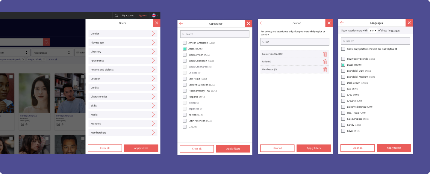
Building the component system
With an initial flow tested internally, we built out the core UI components using the new brand — considered as a system, designed to work cohesively across different areas of the rebranded site.
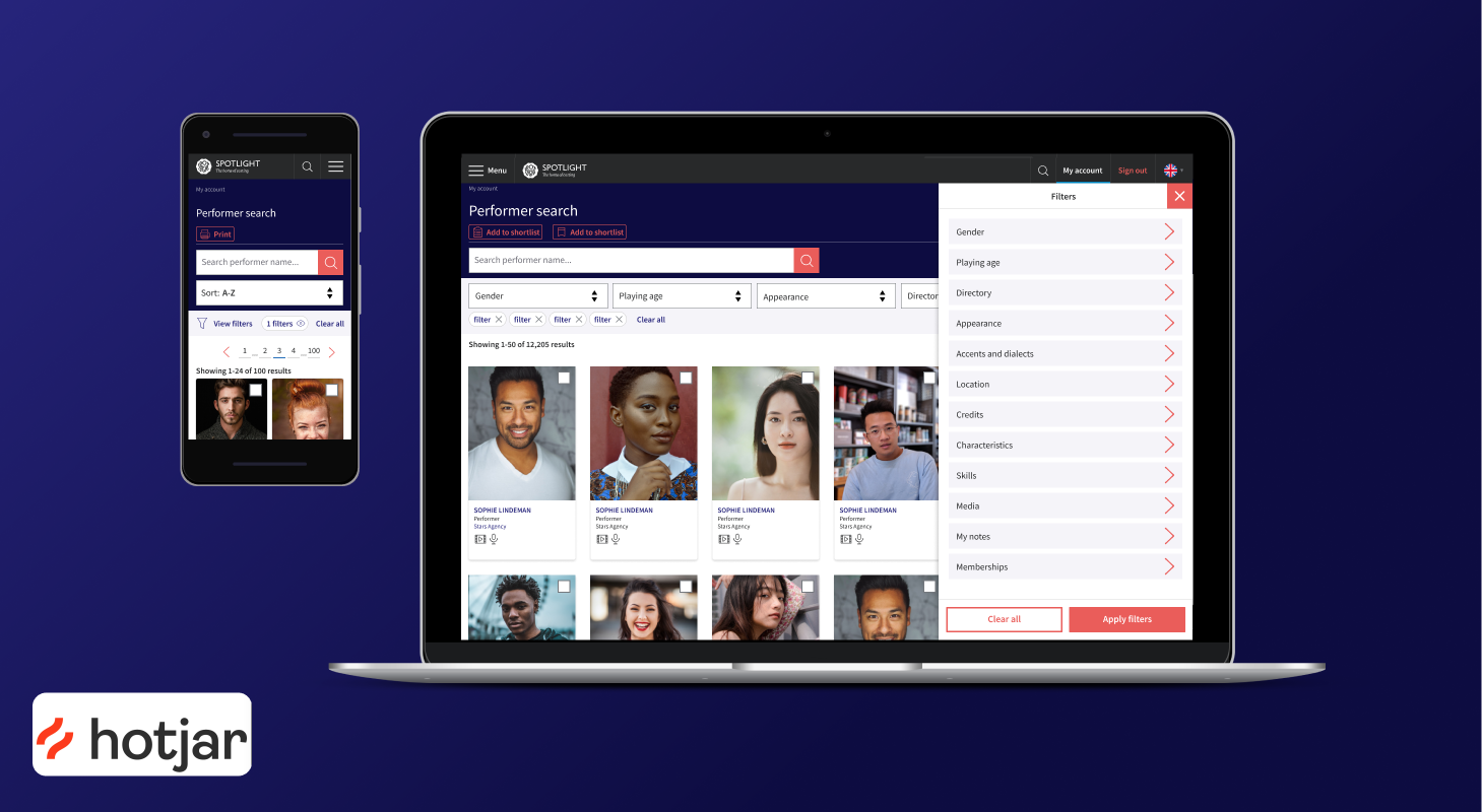
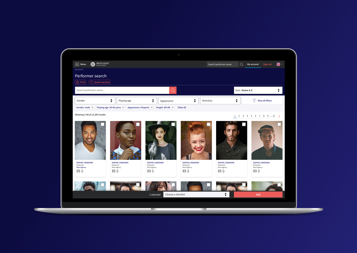
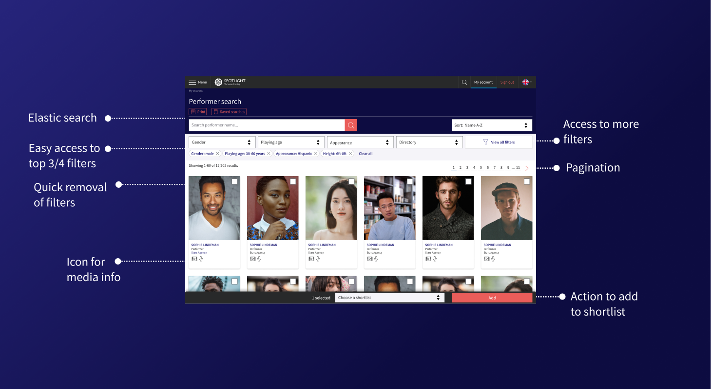
Primary search bar with inline top filters, active filter chips and a sort control — with desktop and mobile responsive variants.
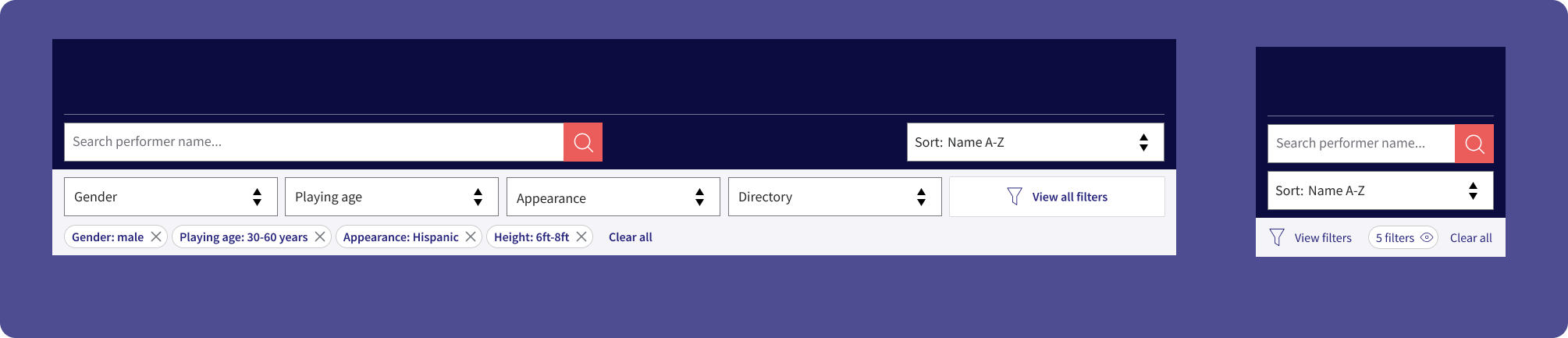
Slide-in overlay with grouped filter categories, searchable long lists, and apply / clear actions.
Designed alongside the versions needed elsewhere on the platform, to reduce development time and keep the UI consistent.
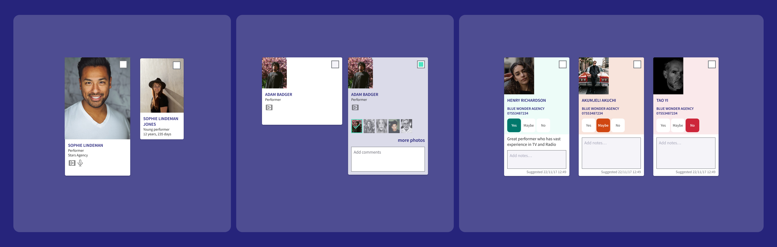
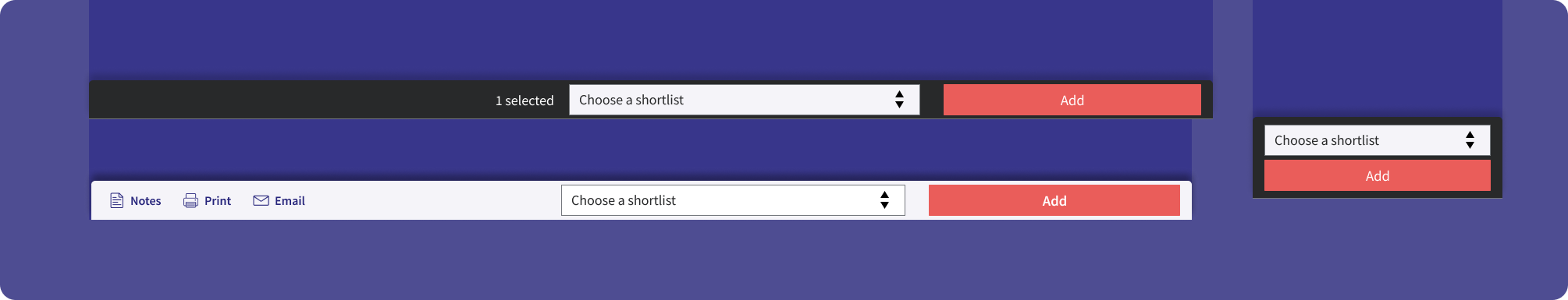
Persistent bottom bar for bulk selection: shortlist dropdown, Add CTA and contextual actions, with a mobile-collapsed variant.
Validating the design with real professionals
We took the prototype to leading casting professionals to validate our design decisions, asking them to complete the three user journeys — A, B and C — in sequence.
What we confirmed
New UI elements were easily navigable. Participants moved through the interface confidently, with minimal guidance.
The actions panel for shortlisting an actor was new, but learnt easily — though it needed better visibility to confirm an action had completed.
Two key iterations
The designs were refined following insights across multiple rounds of testing, tweaking components each time. These are just a couple of examples of key iterations.
Search bar enhancement
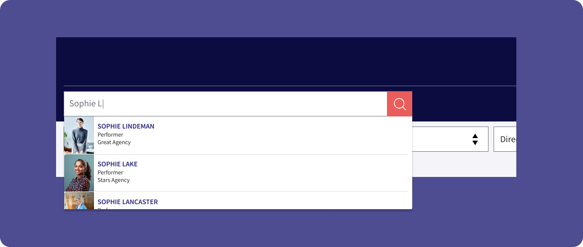
A dropdown on the search bar that previews an actor's headshot, name and location — so casting professionals can go straight to a profile without returning to the full results page.
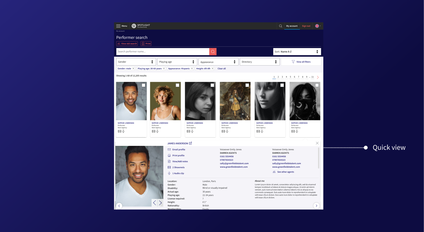
Quick view
Faster access to performer details without ever leaving the results page.
The first iteration of Quick view used an eye icon on each performer card, triggering an overlay on top of the results page. In testing it proved slower than expected — casting professionals didn't find the icon intuitive, and the overlay interrupted their scanning flow rather than supporting it. We rebuilt Quick view as an in-page expansion: the card opened inline within the results list, letting users scroll through profile details without losing their place in the results. The second version tested significantly better.
However, there was significant potential developer effort to build this in-page profile, so we released it as a staged design with feedback from users as to what info was most important in this Quick view.
Designing in step with engineering
The final piece of design work was a close collaboration with engineering, making sure the filter and search system behaved exactly as users needed.
Elasticsearch
Fuzzy matching and relevance ranking surfaced performers even with partial or alternative name spellings.
Real-time updates
Results updated instantly as filters changed — no page reloads, no dead ends.
Filter specs
Full documentation of filter hierarchy, interaction states and edge cases, handed to the engineering team.
A staged rollout that reduced risk
-
01
Closed beta with a small group of casting professionals
We tested core search and filter functionality before any wide release, surfacing UX issues in filtering logic in a low-stakes environment.
-
02
Beta launch with reduced filters
We deliberately launched with a subset of filters and asked casting professionals directly: "What filters do you need?" — letting users drive prioritisation for the next sprint.
-
03
Quick-view card launch with Hotjar
A reduced quick-view card went out with Hotjar session recording, asking users what they wanted to see — so card content was driven by real need, not assumption.
-
04
Full launch
Hotjar feedback and session recordings continued post-launch, giving a live signal on behaviour and satisfaction as the wider audience met the new system.
A search tool that landed well
Most critical feedback referenced functionality already on the product roadmap, or reflected personal aesthetic preferences — not core usability failures. The staged rollout gave us real confidence in the direction, with user input shaping both the filter set and the quick-view card before full release.
A big learning moment for me was that the project showed how a complex, legacy tool can be rebuilt incrementally — each rollout round reducing risk while surfacing the next layer of genuine user need.