Cinematic, informative actor profiles
A media-first profile experience that lets images and showreels shine — beautiful to scroll through, accessible to all, and built for fast-paced casting workflows.

In casting, the profile is the first impression
Filmmakers is an actor profile and casting platform competing in a space where first impressions are everything. Casting professionals form rapid judgements based on how a profile looks and how quickly they can reach the media and credits they need.
I was recruited specifically for my UX background with casting professionals — bringing years of direct feedback from casting directors, assistants and actors to every design decision.
Media wasn't getting the weight it needed
The existing profile experience failed to give media the visual weight casting professionals needed to make quick, confident decisions — leaving actors undersold and casting directors undersupported.
The brief was unambiguous from the outset:
"Profiles must be beautiful and a delight to scroll through."
"Images and media need to shine."
"The design must work for both high- and low-content users."
From accumulated research to a cinematic profile
-
01
Domain knowledge as a research method
Rather than starting from scratch with generative research, I drew on years of accumulated feedback from casting directors, assistants and actors gathered at a previous role. That gave the project an unusual advantage: a clear picture of what both sides of the platform needed before a single wireframe was drawn. Casting professionals consistently prioritised visual media above all else — but they needed to see it side by side with an actor's credits and key information.
-
02
Competitive & Comparative analysis — what the market was getting wrong
I analysed direct competitor platforms and world-class agency websites. A consistent gap emerged: most actor-profile platforms treated media as one content type among many, giving it equal, is even less, visual weight to text. None had achieved the balance of making media dominant while keeping all supporting data immediately accessible. That gap defined the design direction.
This lead to focusing on media-driven websites. I looked at leading streaming platforms for their approach to hierarchy, image handling and content density.
Media-driven references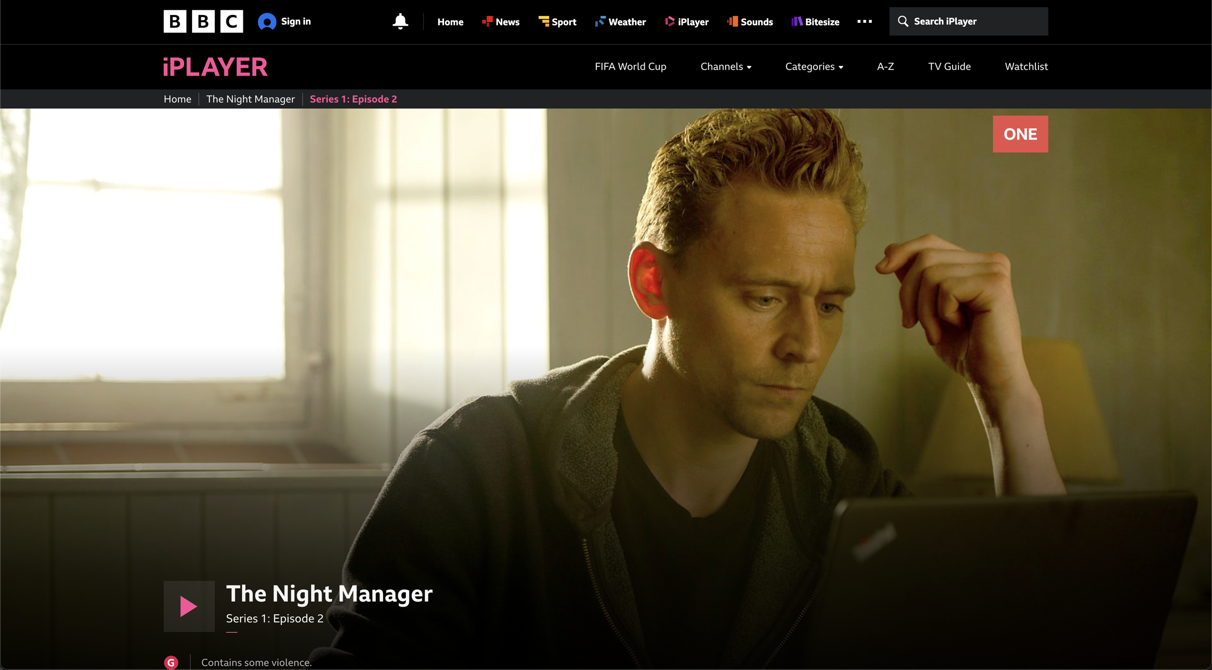 BBC iPlayer
Full-bleed still, recessive navigation and one play control. Media is the entire canvas and the next action is unmistakable.
 Netflix
An immersive hero you can act on immediately, with supporting rows revealed below on scroll — proof media can lead while detail stays one gesture away.
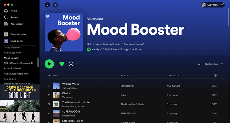 Spotify
Big artwork and an oversized title set the tone, then a calm, scannable list carries dense metadata without ever fighting the hero.
-
03
Content mapping — designing for the full range of actors
The platform needed to work for actors with rich media libraries and for those with minimal content. I used data on which content types — headshots, showreels, credits, biography — were viewed most frequently to establish a hierarchy that served both cases. Progressive disclosure became the structural principle: essential visuals front and centre, supporting detail accessible but not competing.
-
04
Design exploration — from data-dense to fully cinematic
Media handling went through a few rounds of refinement before achieving the full-width cinematic quality the brief required. The first round established the layout structure; the second addressed the quality and transition behaviour of image and showreel presentation.


A media-first profile architecture
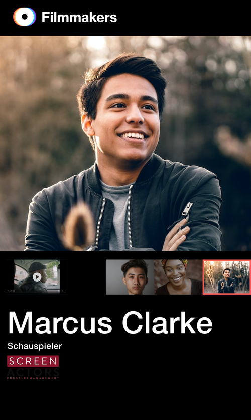
Media-first content gets dominant visual weight while all actor data stays accessible through layered navigation — designed to work for both content-rich and content-light profiles.
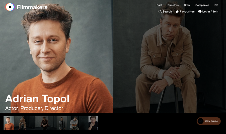
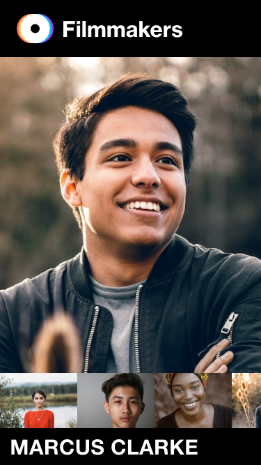
- Full-width immersive headshots — headshots, both portrait and landscape, treated as the primary focus in an almost editorial magazine style, not a thumbnail within a layout grid.
- Showreels always one click away — a persistent media module layered over the large gallery images keeps showreels and audio reels reachable at any point in the profile.
- Flexible grid system — layouts that handle varying content density gracefully across mobile and desktop, with no empty states or broken compositions for low-content actors.
- Dynamic navigation — sleek headers and menu bars giving casting professionals fast access to specific content types without losing context.
- Accessibility throughout — multilingual support, dark and light mode, and inclusive design principles applied without compromising visual quality.


Qualitative, and grounded in expertise
The outcome was a cinematic profile experience emerged directly from what casting professionals said they needed.
-
"Profiles must be beautiful and a delight to scroll through."
The full-width, media-first layout with smooth scroll transitions made profiles cinematic to move through — beauty became the structure of the page, not a coat of decoration on top of it.
-
"Images and media need to shine."
Headshots and showreels were promoted to the primary canvas rather than thumbnails inside a grid, giving media dominant visual weight on every profile.
-
"The design must work for both high- and low-content users."
The flexible grid and progressive-disclosure system held up for rich media libraries and sparse profiles alike — no empty states, no broken compositions at either end of the range.
-
Beyond the brief — navigation built around how casting professionals work
Drawing on years of first-hand research with casting professionals, I added navigation tuned to how they actually move through profiles — fast jumps to media, credits and contact without losing their place while working through a shortlist.
The project demonstrated that deep domain knowledge is a legitimate design method — the years of first-hand research with casting professionals reduced the risk of expensive wrong turns and produced a design that felt right to both sides of the platform from the first round of feedback.