Case studies
These projects are intended to highlight how I work and are not exhaustive of my work within these companies > See Work page for an overview of my experience.
Flexible search & filter system for casting platform
Company: Spotlight | Role: UI/UX Designer | Skills: UX Research | UI Design | Testing | Accessibility | Collaboration

Goal
Redesign a dated, non-responsive search tool used by casting professionals to find performers.
The aim:
Simplify complex search behaviours
Improve speed, accuracy, and accessibility
Create a consistent experience across desktop and mobile platforms
Approach
I began with in-depth user interviews to understand how casting professionals search under intense time pressure, and where friction occurred in their workflow.
Complementing this qualitative insight, I analysed search analytics to identify the most-used filters and session drop-off points.
Key findings:
The top five filters appeared in 80% of all sessions
Users often needed quick access to niche filters beyond the top set
Certain filters needed bespoke UI components that met users needs
These insights set the foundation for a unified, data-informed redesign.
Feedback
Through iterative workshops and high-fidelity Figma prototypes, I tested multiple interaction models to blend speed with flexibility.
Core explorations included:
Introducing a drawer-based filter UI, allowing fast scanning on both desktop and mobile
Testing real-time result updates during filtering to eliminate “dead ends”
Creating quick-view cards that displayed essential performer info without leaving the search view
I validated prototypes with active users, refining microinteractions, transitions, and responsive layouts based on feedback.
Outcome
The final design delivered:
A clean, responsive UI with top filters visible and secondary filters housed in a smart drawer
Elastic search integration, supporting dynamic results and faster iteration within sessions
Streamlined information hierarchy via quick-view cards showing the most relevant performer data
Improved accessibility and usability across devices, reducing search completion time and cognitive load
The redesign elevated a dated internal tool into a professional-grade platform optimised for speed, flexibility, and inclusivity.

Desktop search & filter results page showing filters applied
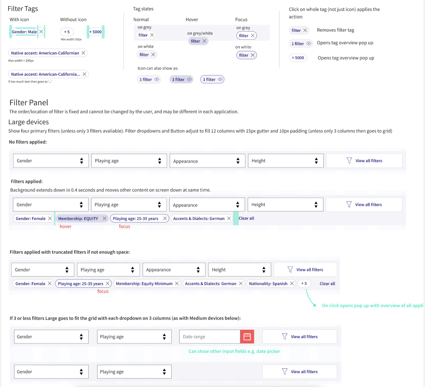
Snapshot of specification page for filter panel
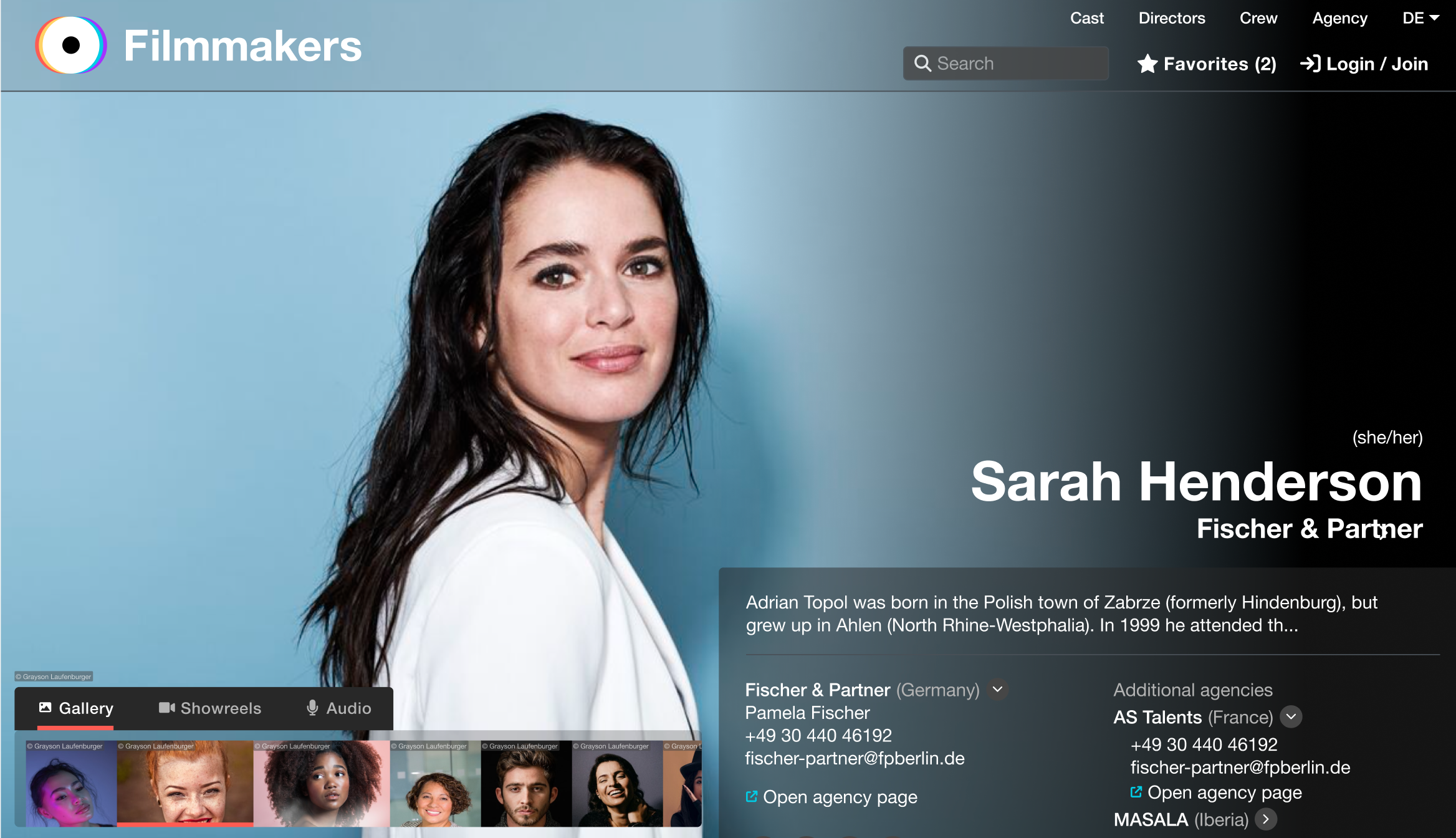
Stunning, informative actor profiles
Company: Filmmakers | Role: Product designer | Skills: UX Research | Branding | UI Design | Accessibility | Collaboration
Goal
To design modern, visually engaging actor profiles that present diverse media and content in a way that feels cinematic yet effortless to navigate.
The aim: balance aesthetics with accessibility, giving actors and casting professionals an experience that’s both delightful and efficient under tight time pressures.
Research
I began with competitive research, analysing not only actor profile platforms but also leading media-driven websites for inspiration around hierarchy, layout, and image handling.
Using data research, I identified which types of content (headshots, showreels, credits, and biographies) were viewed most frequently. These insights guided how visual weight and interaction states were prioritised in the design.
This data shaped the information hierarchy, ensuring that essential visuals were front and centre, while contextual details remained accessible through smooth, layered navigation.
Design Approach
Working iteratively in Figma, I explored several layout systems. Key explorations included:
Flexible grid layouts to handle profiles with varying content density on mobile and desktop
Progressive disclosure for text-heavy sections
Media-first layouts that allowed seamless transitions between images and showreels
Accessibility and inclusivity remained core design principles — ensuring that all content could be enjoyed across devices, without sacrificing beauty.
(All keeping in mind multi-lingual content and Dark and Light mode requirements)
Feedback & Business Requirements
“Profiles must be beautiful and a delight to scroll through.”
“Images and media need to shine.”
“The design must work for both high- and low-content users.”
“Incorporate the new brand look and feel.”
These comments led to refinements around colour hierarchy, typography pairing, and adaptive layouts for content-light profiles.
Outcome
A media-first interface with full-width immersive visuals
Smooth scroll transitions from image galleries into detailed bio content
Dynamic navigation through sleek headers and menu bars to allow easy access to content and assets
Typography and iconography aligned with the new brand’s playful yet professional tone
A visually rich, accessible, and intuitive profile experience that elevated the brand identity while improving usability for fast-paced casting workflows.
Intuitive Membership Payments
Company: Spotlight | Role: Product designer | Skills: UX Research | UI Design | User Testing | Accessibility | Collaboration
Goal
To redesign the membership payment experience, which users found confusing and inconsistent, while reusing as much of the existing infrastructure as possible.
The challenge was to create a streamlined, intuitive flow that simplified decision-making and aligned with the organisation’s new visual identity.
Research & Discovery
I started by mapping existing user flows to identify friction points in the payment journey.
User feedback highlighted confusion when comparing or switching between membership tiers and lack of clarity around membership offerings.
To validate these insights, I analysed competitor membership models to understand best practices in transparency and conversion design.
Design Approach
Working collaboratively with developers, I explored solutions that balanced user needs with technical feasibility.
Key design priorities included:
Simplifying navigation between membership tiers
Clarifying the membership offerings
Ensuring the flow supported multiple user scenarios (new sign-up, renewal, upgrade, downgrade)
I produced interactive Figma prototypes to test early with users, validating copy clarity, button hierarchy, and step logic before final handoff.
Outcome
The final design delivered:
A clean, guided flow that clearly connected membership selection, pricing, and payment
Dynamic UI showcasing new branding and increasing engagement at the checkout
Streamlined checkout that reduced developer workload by consolidating multiple user paths into one flexible system
Early testing showed improved task completion rates and reduced user drop-off during payment
The result: a unified, intuitive experience that both celebrates the brand and supports frictionless membership management.