Enhancing talent search for busy casting directors
Spotlight's search is how casting professionals find performers in a database of over 70,000 entries. Over years of organic growth it had become dated and non-responsive. It was rebuilt as part of a wider rebrand, and search and filter was my project from research to launch.
Problem
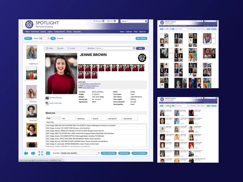
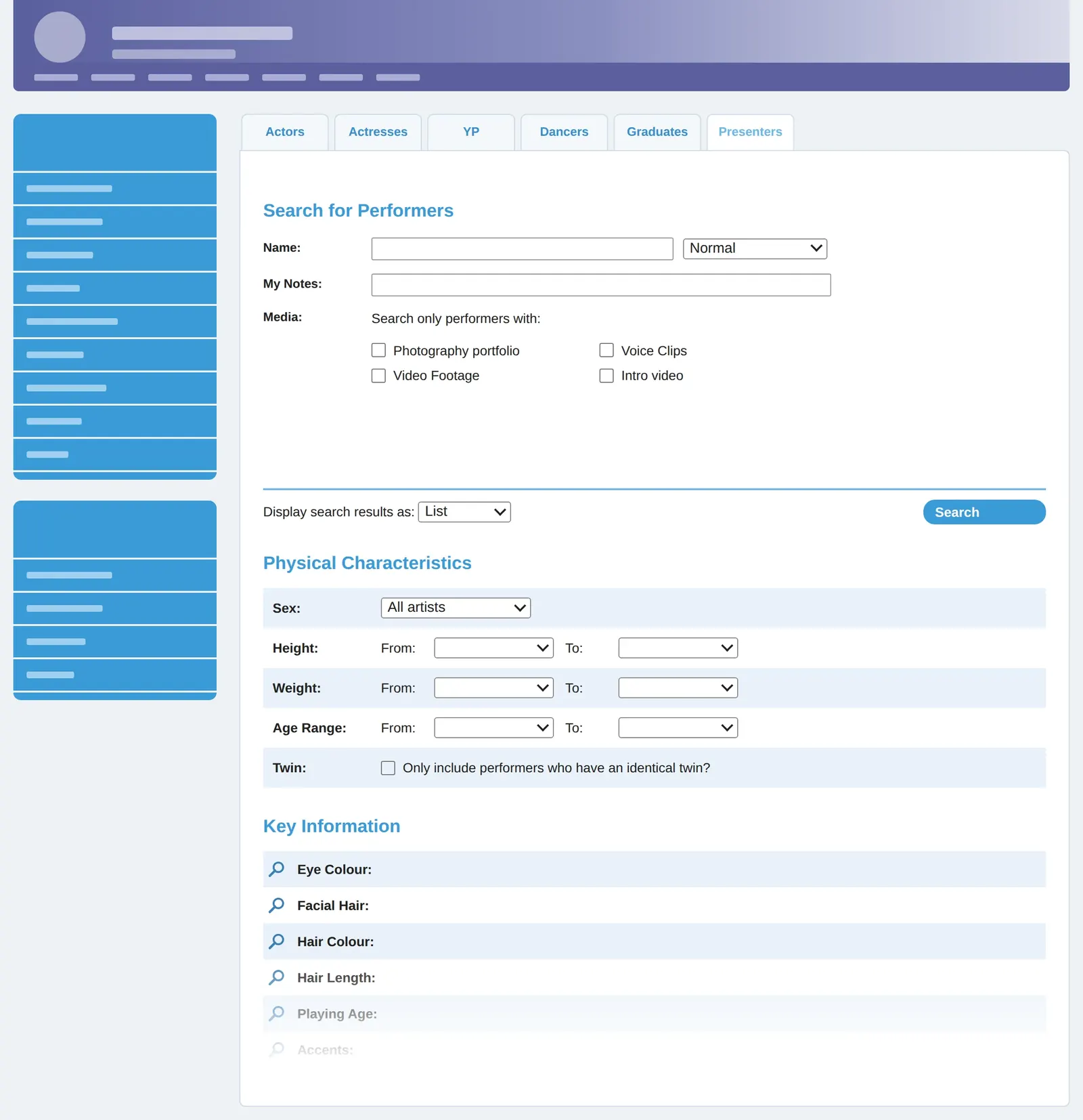
The old search was a form. Users filled in the whole page, clicked submit and only then saw results. To change anything, they had to start again.
The legacy search was desktop only. One of the rebrand's core needs was a responsive platform.
Casting directors looking for a specific performer had to use the same arduous form as someone looking for a range of actors who might fit certain criteria.
Moving between filters was slow and never showed potential numbers of results until they had submitted the full form.
Research
Research findings
Card-sorting workshops, run before I joined, had mapped how users grouped the legacy search options. Analytics, customer surveys and follow-up interviews went further, and I turned all of it into the findings the design worked from. Two shaped the page:
- 80% of all sessions used a combination of the same five filters.
- Users still repeatedly needed niche filters beyond that top set.
User journeys
From this research, I pulled out three core journeys the new design had to serve:
“I want to find a specific performer whose name I already know.”
“I'm looking for an actor matching specific physical and professional criteria.”
“I'm looking for an actor by location, language, or accent.”
Competitor research
My competitor research, from casting platforms to Amazon and LinkedIn, showed most rivals used fixed filter panels that assume a desktop screen. Our users searched on mobile too, so a combination of fixed filters on desktop, with a slide-in filter drawer, was the clear direction.
Top filters
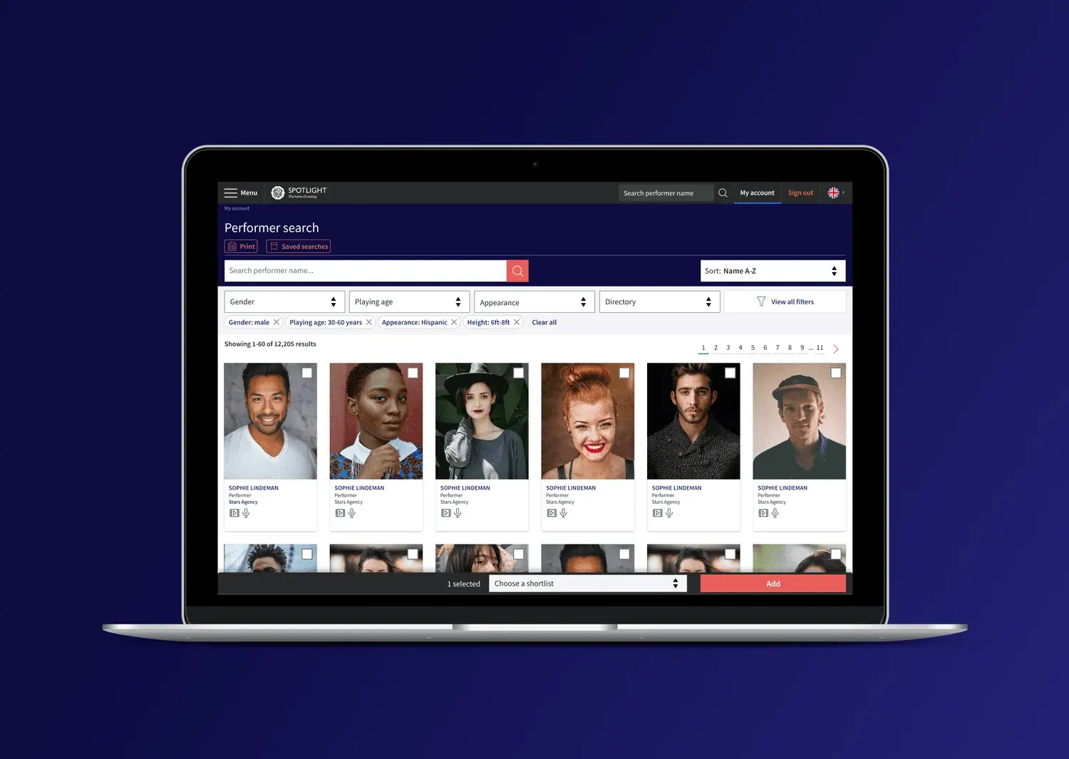
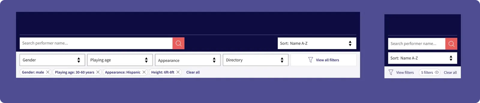
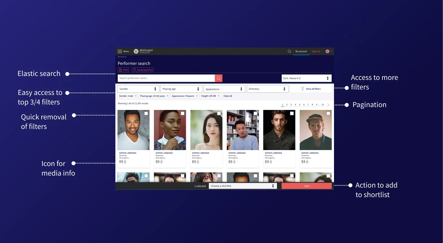
I put the five most-used filters inline with the search bar, with active filter chips and sorting, and moved everything else into the drawer, grouped and with searchable long lists. Most sessions could stay in the top bar, and nothing a specialist search depends on would be hard to reach. Filter chips and results that update as filters change meant users could adjust a search instead of starting again. The trade-off is that niche filters sat one step further away, but the 80% figure validated that choice.
- 1
Top five filters
Always accessible on desktop.
- 2
Filter chips
Each active filter shows as a chip that can be removed on its own, so users adjust a search easily.
- 3
Mobile
On mobile the filters fold into one button, with a count of the filters applied.
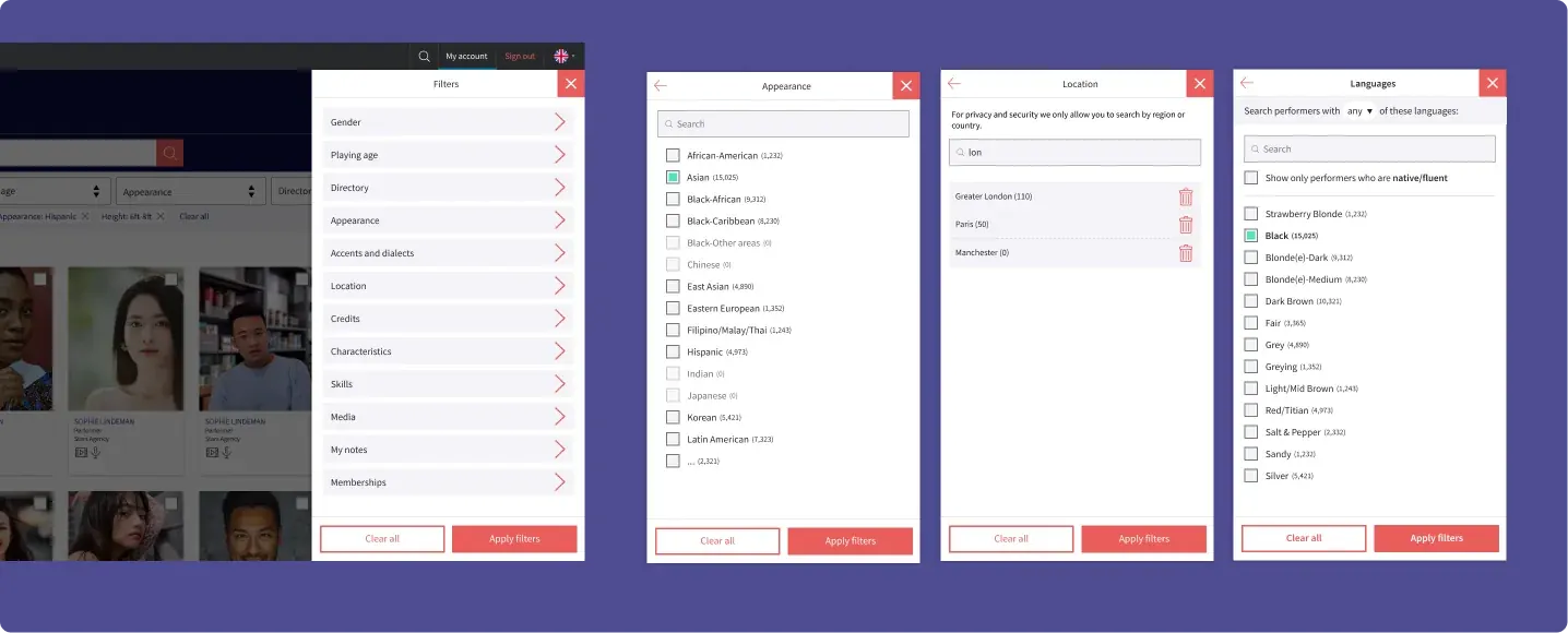
- 1
Grouped filters
Plenty of space for numerous filters in the drawer.
- 2
Searchable long lists
Long lists have their own search.
- 3
No dead ends
Options that would return no results are disabled.
- 4
Results count
Numbers show users how many results before choosing one.
For journey A, a dropdown on the search bar previews a performer's headshot, name and location, so users can go straight to a profile.
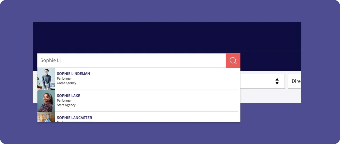
- 1
Search by name
Typing a name shows matching performers straight away.
- 2
Profile preview
Each match previews the performer's headshot, name and agency, so users can go straight to their profile.
Specialist filters
The research had shown that some filters needed bespoke components. The clearest case was for languages and accents. Some casting directors needed to be precise: whether an actor speaks a language natively or fluently, and whether an accent is native. I designed a custom filter for this and tested it internally with Maze.
My research into best practices underlined that a filter should only appear if it can still return a result alongside the filters already applied. This ensured users never hit a dead end. I briefed the product manager on why it mattered and made sure engineering built it that way.
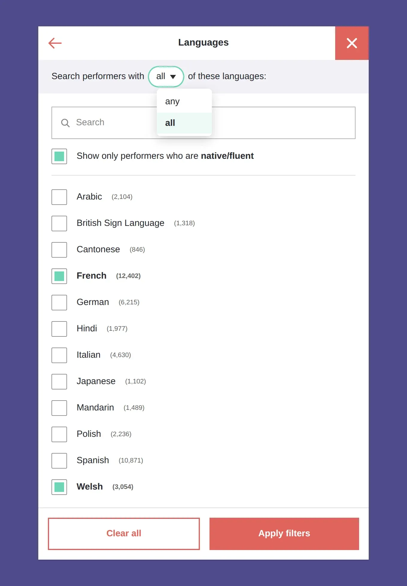
- 1
All / any
Filter logic allowed casting to narrow down exclusively or inclusively.
- 2
Native/fluent
Check box allowing casting to be extra specific.
- 3
Results count
Prevented dead ends and expectations.
- 4
Search within filters
Prevented scrolling through long lists of facets.
Negotiating a launch plan
Close to launch, we were notified we would release with fewer filters to meet our goals. I knew from the research that some casting directors used niche filters every day, and I raised the risk of removing them. The product manager decided to run a beta first, launching with a subset of filters and asking via Hotjar, “What filters do you need?” These answers decided which filters were prioritised next.
Quick view iteration
I ran two rounds of testing with the other designer in our company. These were with three small casting companies and the BBC's casting team.
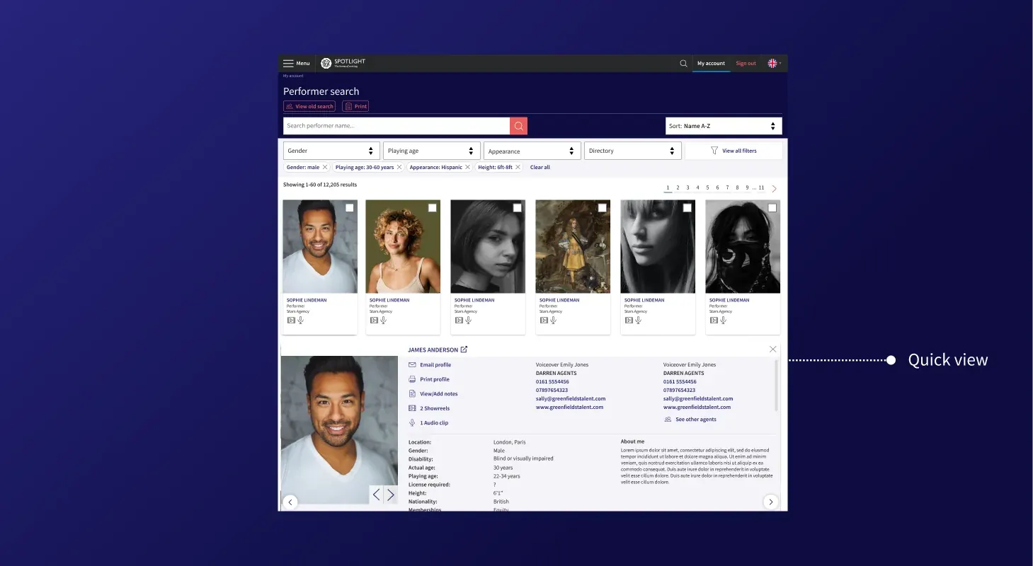
My first Quick view put an eye icon on each performer card that opened an overlay. Casting professionals didn't find the icon intuitive, and the overlay broke their scanning of the results. I redesigned it as an in-page expansion: clicking anywhere on the main area of the card opens it inline, so users can read a profile without losing their place. In the next round, nobody had to work out what an icon meant.
The full inline profile was a big build for engineering. So we released a reduced Quick view card first and used Hotjar to learn which details users actually needed.
Result
85%
from post-launch Hotjar ratings
After launch, 85% of Hotjar ratings scored the new search 4 or 5 out of 5. Most critical feedback was about features already on the roadmap, or personal taste, not core usability problems.
Today
How I'd approach it today.
- To enhance usability testing, I'd build AI agents to play users A, B and C, plus niche users, to try out my flows between sessions with real casting directors.
- For developers, I'd clarify the search logic through vibe coded prototypes with real behaviour, like partial name matching and live results.