Stunning, informative
actor profiles
Designing a media-first profile experience for the casting industry — balancing visual richness with speed, accessibility, and brand cohesion.
Role & Context
I was the sole designer on Filmmakers, a platform serving actors, agents, and casting professionals across Europe. My scope covered improving UX across multiple interconnected systems while leading a rebrand and platform merger — all within a small, high-velocity team.
- Improve UX across multiple systems for actors, agents and casting professionals
- Sole designer for rebrand and merging of platforms
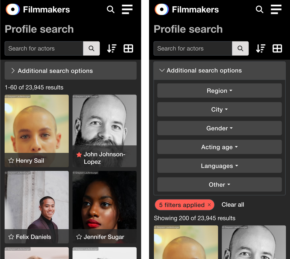
- Built design system & component library
- Multilingual and accessible platform design
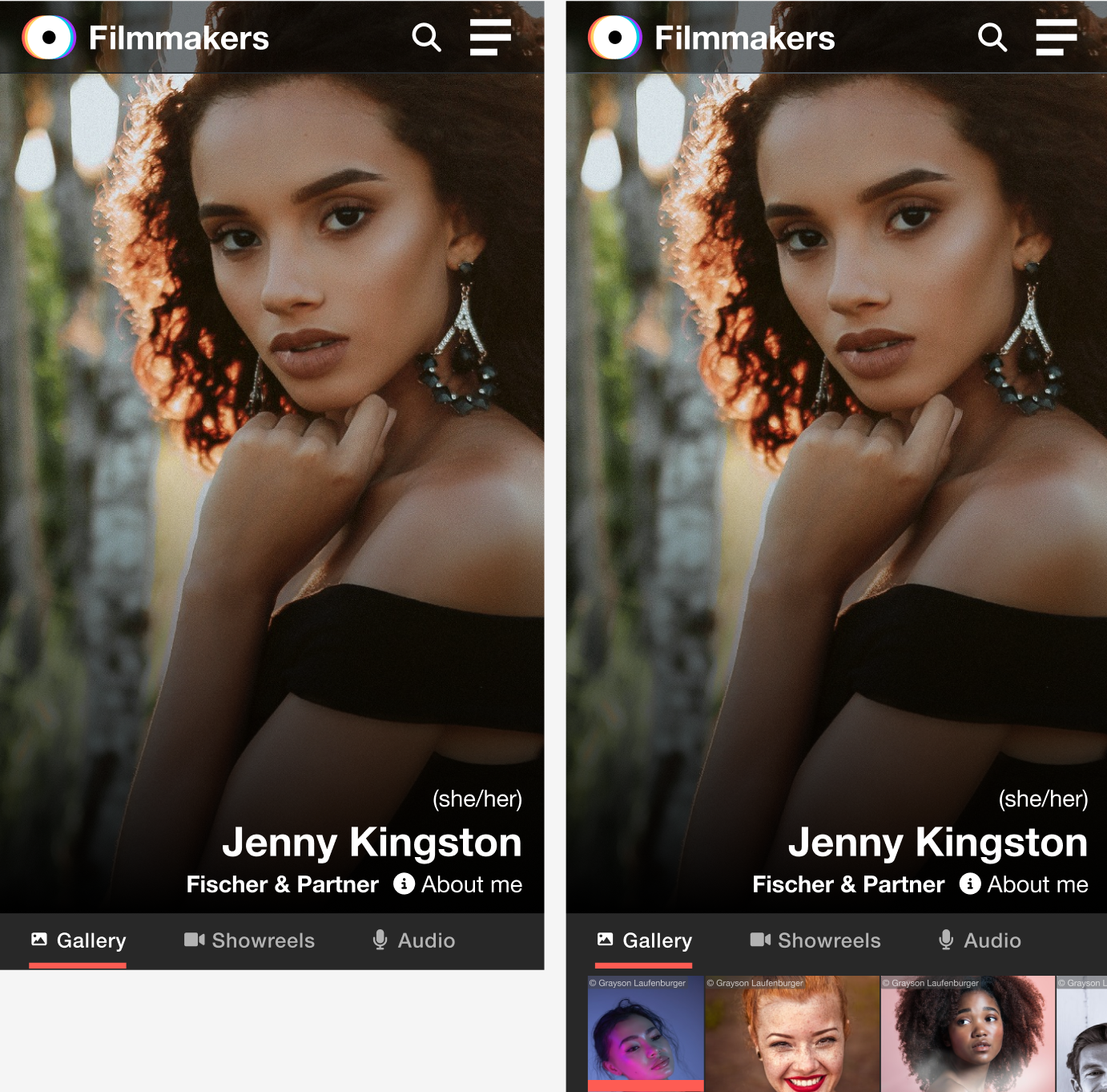
- Responsive design across all breakpoints
The Challenge
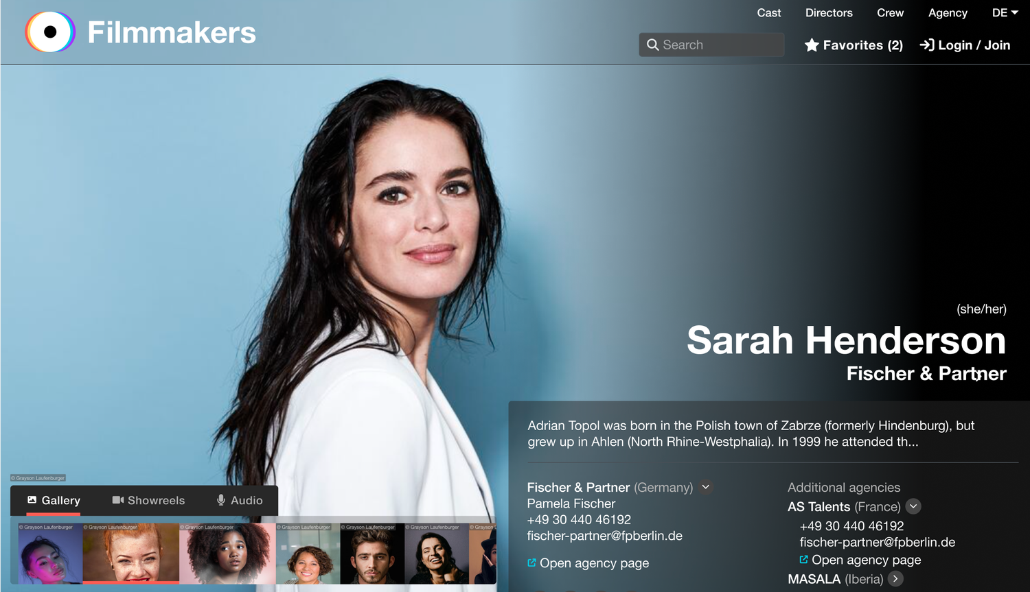
Actor profiles are high-stakes interfaces — they need to impress casting directors in seconds, present diverse media types clearly, and work equally well for a first-time actor uploading a headshot and a seasoned professional with a full showreel catalogue.
Research & Approach
I began with competitive research, analysing not only actor profile platforms but also leading media-driven websites for inspiration around hierarchy, layout, and image handling. This broadened the creative reference pool well beyond the industry norm.
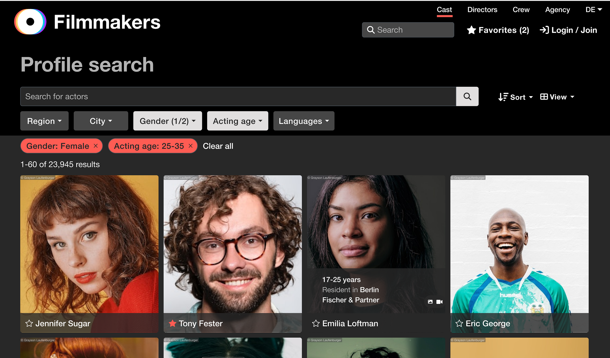
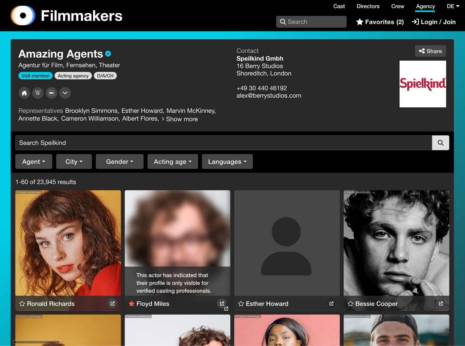
Using data research, I identified which types of content — headshots, showreels, credits, and biographies — were viewed most frequently. These insights guided how visual weight and interaction states were prioritised in the design.
This data shaped the information hierarchy, ensuring that essential visuals were front and centre, while contextual details remained accessible through smooth, layered navigation.
Creative Exploration
Working iteratively in Figma, I explored several layout systems to find the right balance between visual impact and usability across a wide range of content densities.
Accessibility and inclusivity remained core design principles throughout — ensuring that all content could be enjoyed across devices, without sacrificing beauty.
Feedback & Business Requirements
Stakeholder feedback was direct and clear — these comments became the design brief that shaped key refinements around colour hierarchy, typography pairing, and adaptive layouts for content-light profiles.
"Profiles must be beautiful and a delight to scroll through."
"Images and media need to shine."
"The design must work for both high- and low-content users."
"Incorporate the new brand look and feel."
Result
A visually rich, accessible, and intuitive profile experience that elevated the brand identity while improving usability for fast-paced casting workflows.
Video Walkthrough
A prototype walkthrough demonstrating the profile experience — gallery navigation, media transitions, and dynamic content layout.